Introduction
Overview
Teaching: 10 min
Exercises: 10 minQuestions
What are expression quantitative trait loci (eQTL)?
How are eQTL used in genetic studies?
Objectives
Describe how an expression quantitative trait locus (eQTL) impacts gene expression.
Describe how eQTL are used in genetic studies.
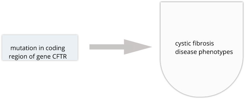
Genome variability influences differential disease risk among individuals. Identifying the effects of genome variants is key to understanding disease biology or organismal phenotype. The effects of variants in many single-gene disorders, such as cystic fibrosis, are generally well-characterized and their disease biology well understood. In cystic fibrosis for example, mutations in the coding region of the CFTR gene alters the three-dimensional structure of resulting chloride channel proteins in epithelial cells, affecting not only chloride transport but also sodium and potassium transport in the lungs, pancreas and skin. The path from gene mutation to altered protein to disease phenotype is relatively simple and well understood.
The most common human disorders, however, involve many genes interacting with the environment and with one another, a far more complicated path to follow than the path from a single gene mutation to its resulting protein to a disease phenotype. Cardiovascular disease, Alzheimer’s disease, arthritis, diabetes and cancer involve a complex interplay of genes with environment, and their mechanisms are not well understood. Genome-wide association studies (GWAS) associate genetic loci with disease traits, yet most GWAS variants for common diseases like diabetes are located in non-coding regions of the genome. These variants are therefore likely to be involved in gene regulation.
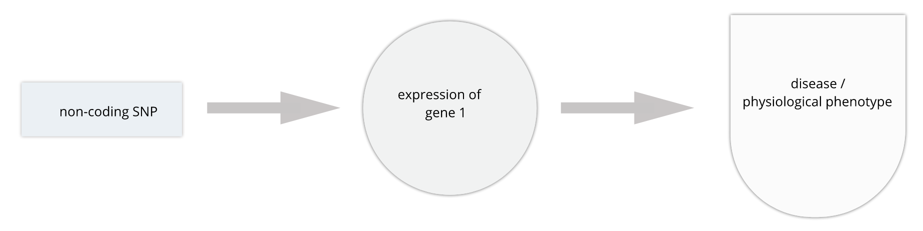
Gene regulation controls the quantity, timing and locale of gene expression. Analyzing genome variants through cell or tissue gene expression is known as expression quantitative trait locus (eQTL) analysis. An eQTL is a locus associated with expression of a gene or genes. An eQTL explains some of the variation in gene expression. Specifically, genetic variants underlying eQTL explain variation in gene expression levels. eQTL studies can reveal the architecture of quantitative traits, connect DNA sequence variation to phenotypic variation, and shed light on transcriptional regulation and regulatory variation. Traditional analytic techniques like linkage and association mapping can be applied to thousands of gene expression traits (transcripts) in eQTL analysis, such that gene expression can be mapped in much the same way as a physiological phenotype like blood pressure or heart rate. Joining gene expression and physiological phenotypes with genetic variation can uncover genes with variants affecting disease phenotypes.
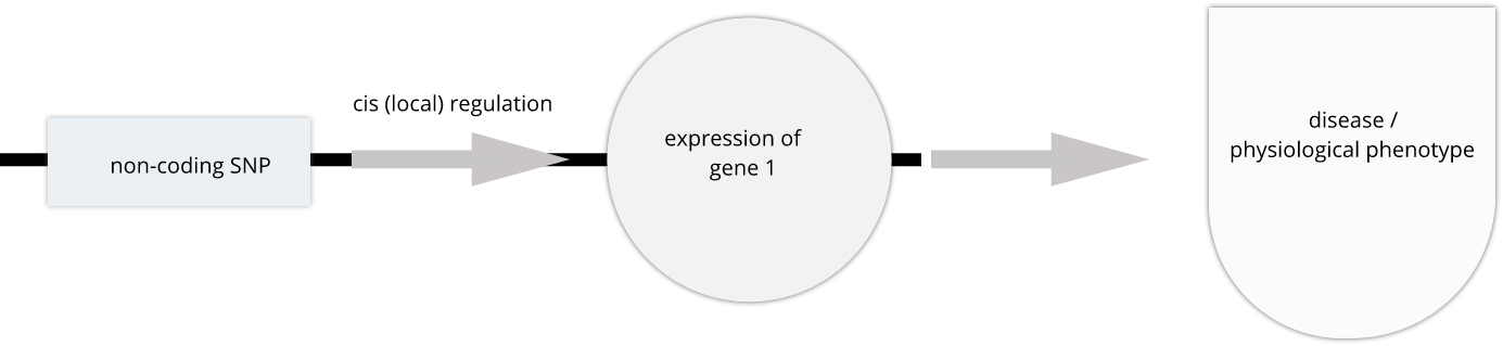
To the simple diagram above we’ll add two more details. Non-coding SNPs can regulate gene expression from nearby on the same chromosome (in cis):
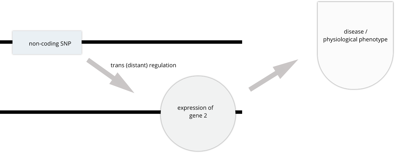
SNPs that affect gene expression from afar, often from a different chromosome from the gene that they regulate are called trans regulators.
In this lesson we revisit genetic mapping of quantitative traist and apply its methods to gene expression. The examples are from Genetic Drivers of Pancreatic Islet Function by Keller, et al. This study offers supporting evidence for type 2 diabetes-associated loci in human GWAS, most of which affect pancreatic islet function. The study assessed pancreatic islet gene expression in Diversity Outbred mice on either a regular chow or high-fat high-sugar diet. Islet mRNA abundance was quantified and analyzed, and the study identified more than 18,000 eQTL.
What are eQTL?
With a partner, discuss
- your understanding of eQTL.
- how mutations result in eQTL and ultimately in disease phenotypes.
- the methods that can be used for eQTL analysis.
Solution
Key Points
An expression quantitative trait locus (eQTL) explains part of the variation in gene expression.
Traditional linkage and association mapping can be applied to gene expression traits (transcripts).
Genetic variants, such as single nucleotide polymorphisms (SNPs), that underlie eQTL illuminate transcriptional regulation and variation.
Genetic Drivers of Pancreatic Islet Function
Overview
Teaching: 15 min
Exercises: 15 minQuestions
How I can learn more from an example eQTL study?
What is the hypothesis of an example eQTL study?
Objectives
Describe an example eQTL study in Diversity Outbred mice.
State the hypothesis from an example eQTL study in Diversity Outbred mice.
Genome-wide association studies (GWAS) often identify variants in non-coding regions of the genome, indicating that regulation of gene expression predominates in common diseases like type II diabetes. Most of the more than 100 genetic loci associated with type II diabetes affect the function of pancreatic islets, which produce insulin for regulating blood glucose levels. Susceptibility to type II diabetes (T2D) increases with obesity, such that T2D-associated genetic loci operate mainly under conditions of obesity (See Keller, Mark P et al. “Genetic Drivers of Pancreatic Islet Function.” Genetics vol. 209,1 (2018): 335-356). Like most GWAS loci, the T2D-associated genetic loci identified from genome-wide association studies (GWAS) have very small effect sizes and odds ratios just slightly more than 1.
This study explored islet gene expression in diabetes. The authors hypothesized that gene expression changes in response to dietary challenge would reveal signaling pathways involved in stress responses. The expression of many genes often map to the same locus, indicating that expression of these genes is controlled in common. If their mRNAs encode proteins with common physiological functions, the function of the controlling gene(s) is revealed. Variation in expression of the controlling gene(s), rather than a genetic variant, can be tested as an immediate cause of a disease-related phenotype.
In this study, Diversity Outbred (DO) mice were fed a high-fat, high-sugar diet as a stressor, sensitizing the mice to develop diabetic traits. Body weight and plasma glucose, insulin, and triglyceride measurements were taken biweekly. Food intake could be measured since animals were individually housed. A glucose tolerance test at 18 weeks of age provided measurement of dynamic glucose and insulin changes at 5, 15, 30, 60 and 120 minutes after glucose administration. Area under the curve (AUC) was determined from these time points for both plasma glucose and insulin levels. Homeostatic model assessment (HOMA) of insulin resistance (IR) and pancreatic islet function (B) were determined after the glucose tolerance test was given. Islet cells were isolated from pancreas, and RNA extracted and libraries constructed from isolated RNA for gene expression measurements.
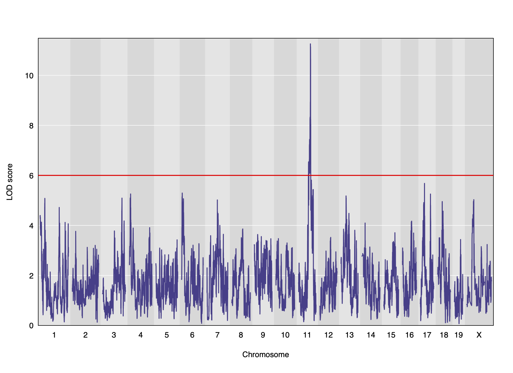
Genome scans were performed with the leave-one-chromosome-out (LOCO) method for kinship correction. Sex and experimental cohort (DO wave) were used as covariates. The results of one scan for insulin area under the curve (AUC) is shown below with a strong peak on chromosome 11. In this lesson, we will look into genes located under this peak.
Key Points
.
.
Load and explore the data
Overview
Teaching: 15 min
Exercises: 30 minQuestions
What data are required for eqtl mapping?
Objectives
To provide an example and exploration of data used for eqtl mapping.
Load the libraries.
library(tidyverse)
library(knitr)
library(corrplot)
# the following analysis is from File S1 Attie_eQTL_paper_physiology.Rmd
# compliments of Daniel Gatti. See Data Dryad entry for more information.
Physiological Phenotypes
The complete data used in these analyses are available from Data Dryad.
Load in the clinical phenotypes.
# load the data
load("../data/attie_DO500_clinical.phenotypes.RData")
See the data dictionary to see a description of each of these phenotypes. You can also view a table of the data dictionary.
pheno_clin_dict %>%
  select(description, formula) %>%
  kable()
| description | formula | |
|---|---|---|
| mouse | Animal identifier. | NA |
| sex | Male (M) or female (F). | NA |
| sac_date | Date when mouse was sacrificed; used to compute days on diet, using birth dates. | NA |
| partial_inflation | Some mice showed a partial pancreatic inflation which would negatively effect the total number of islets collected from these mice. | NA |
| coat_color | Visual inspection by Kathy Schuler on coat color. | NA |
| oGTT_date | Date the oGTT was performed. | NA |
| FAD_NAD_paired | A change in the method that was used to make this measurement by Matt Merrins’ lab. Paired was the same islet for the value at 3.3mM vs. 8.3mM glucose; unpaired was where averages were used for each glucose concentration and used to compute ratio. | NA |
| FAD_NAD_filter_set | A different filter set was used on the microscope to make the fluorescent measurement; may have influenced the values. | NA |
| crumblers | Some mice store food in their bedding (hoarders) which would be incorrectly interpreted as consumed. | NA |
| birthdate | Birth date | NA |
| diet_days | Number of days. | NA |
| num_islets | Total number of islets harvested per mouse; negatively impacted by those with partial inflation. | NA |
| Ins_per_islet | Amount of insulin per islet in units of ng/ml/islet. | NA |
| WPIC | Derived number; equal to total number of islets times insulin content per islet. | Ins_per_islet * num_islets |
| HOMA_IR_0min | glucose*insulin/405 at time t=0 for the oGTT | Glu_0min * Ins_0min / 405 |
| HOMA_B_0min | 360 * Insulin / (Glucose - 63) at time t=0 for the oGTT | 360 * Ins_0min / (Glu_0min - 63) |
| Glu_tAUC | Area under the curve (AUC) calculation without any correction for baseline differences. | complicated |
| Ins_tAUC | Area under the curve (AUC) calculation without any correction for baseline differences. | complicated |
| Glu_6wk | Plasma glucose with units of mg/dl; fasting. | NA |
| Ins_6wk | Plasma insulin with units of ng/ml; fasting. | NA |
| TG_6wk | Plasma triglyceride (TG) with units of mg/dl; fasting. | NA |
| Glu_10wk | Plasma glucose with units of mg/dl; fasting. | NA |
| Ins_10wk | Plasma insulin with units of ng/ml; fasting. | NA |
| TG_10wk | Plasma triglyceride (TG) with units of mg/dl; fasting. | NA |
| Glu_14wk | Plasma glucose with units of mg/dl; fasting. | NA |
| Ins_14wk | Plasma insulin with units of ng/ml; fasting. | NA |
| TG_14wk | Plasma triglyceride (TG) with units of mg/dl; fasting. | NA |
| food_ave | Average food consumption over the measurements made for each mouse. | complicated |
| weight_2wk | Body weight at indicated date; units are gm. | NA |
| weight_6wk | Body weight at indicated date; units are gm. | NA |
| weight_10wk | Body weight at indicated date; units are gm. | NA |
| DOwave | Wave (i.e., batch) of DO mice | NA |
# convert sex and DO wave (batch) to factors
pheno_clin$sex = factor(pheno_clin$sex)
pheno_clin$DOwave = factor(pheno_clin$DOwave)
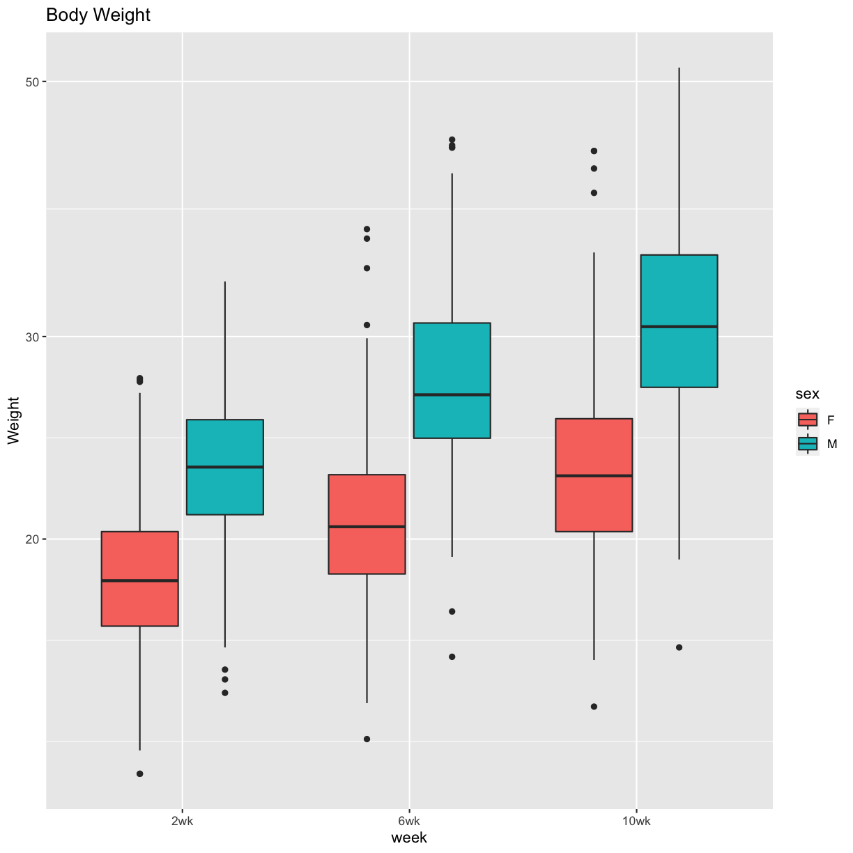
Figure 1 Boxplots
pheno_clin %>%
  select(mouse, sex, starts_with("weight")) %>%
  gather(week, value, -mouse, -sex) %>%
  separate(week, c("tmp", "week")) %>%
  mutate(week = factor(week, levels = c("2wk", "6wk", "10wk"))) %>%
  ggplot(aes(week, value, fill = sex)) +
    geom_boxplot() +
    scale_y_log10() +
    labs(title = "Body Weight", y = "Weight")
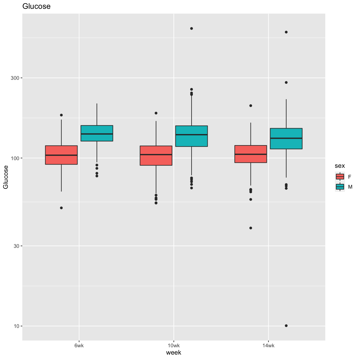
pheno_clin %>%
  select(mouse, sex, starts_with("Glu")) %>%
  select(mouse, sex, ends_with("wk")) %>%
  gather(week, value, -mouse, -sex) %>%
  separate(week, c("tmp", "week")) %>%
  mutate(week = factor(week, levels = c("6wk", "10wk", "14wk"))) %>%
  ggplot(aes(week, value, fill = sex)) +
    geom_boxplot() +
    scale_y_log10() +
    labs(title = "Glucose", y = "Glucose")
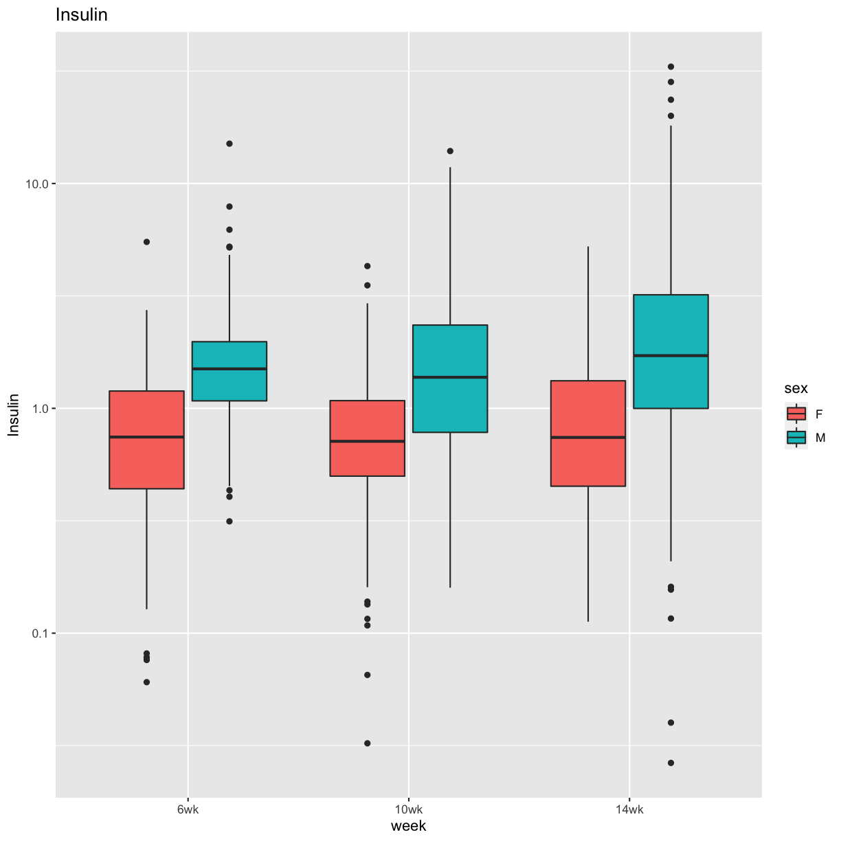
pheno_clin %>%
  select(mouse, sex, starts_with("Ins")) %>%
  select(mouse, sex, ends_with("wk")) %>%
  gather(week, value, -mouse, -sex) %>%
  separate(week, c("tmp", "week")) %>%
  mutate(week = factor(week, levels = c("6wk", "10wk", "14wk"))) %>%
  ggplot(aes(week, value, fill = sex)) +
    geom_boxplot() +
    scale_y_log10() +
    labs(title = "Insulin", y = "Insulin")
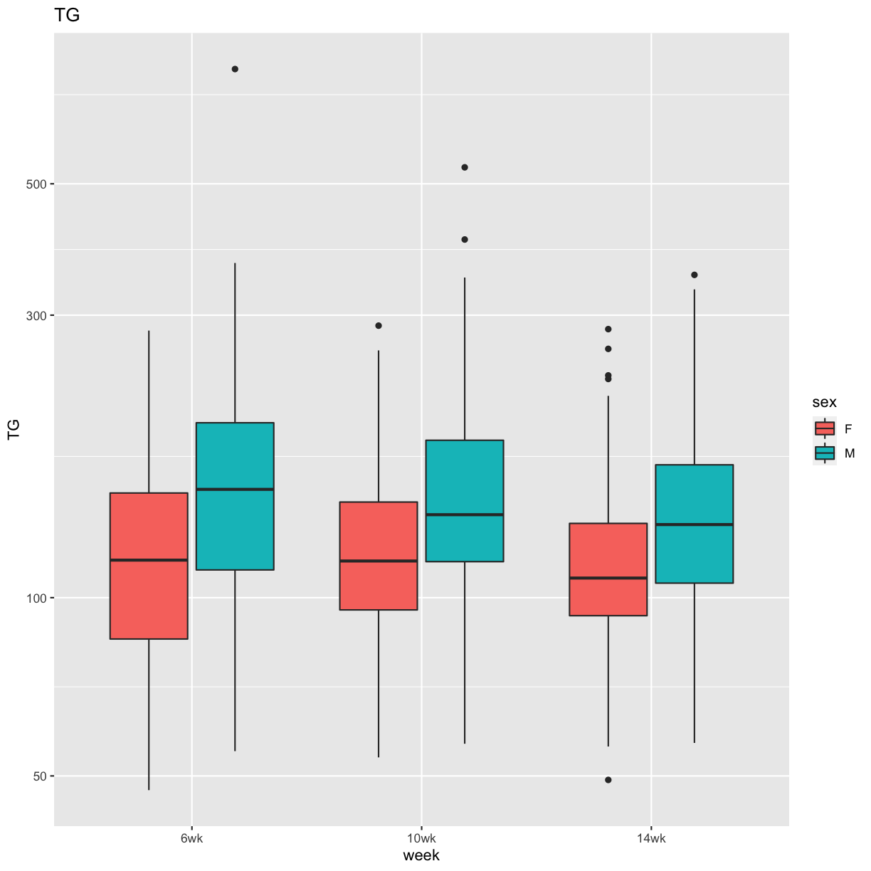
pheno_clin %>%
  select(mouse, sex, starts_with("TG")) %>%
  select(mouse, sex, ends_with("wk")) %>%
  gather(week, value, -mouse, -sex) %>%
  separate(week, c("tmp", "week")) %>%
  mutate(week = factor(week, levels = c("6wk", "10wk", "14wk"))) %>%
  ggplot(aes(week, value, fill = sex)) +
    geom_boxplot() +
    scale_y_log10() +
    labs(title = "TG", y = "TG")
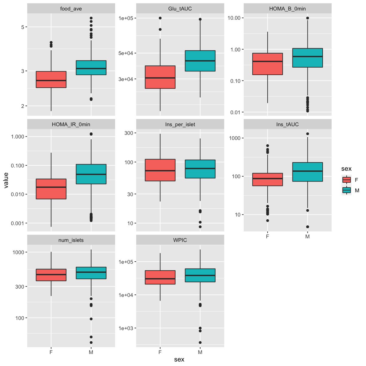
pheno_clin %>%
  select(mouse, sex, num_islets:Ins_tAUC, food_ave) %>%
  gather(phenotype, value, -mouse, -sex) %>%
  ggplot(aes(sex, value, fill = sex)) +
    geom_boxplot() +
    scale_y_log10() +
    facet_wrap(~phenotype, scales = "free_y")
QA/QC
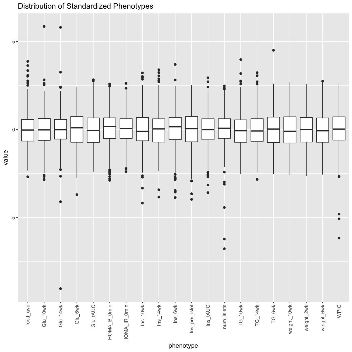
Log transform and standardize each phenotype. Consider setting points that are more than 5 std. dev. from the mean to NA. Only do this if the final distribution doesn’t look skewed.
pheno_clin_log = pheno_clin %>%
                   mutate_if(is.numeric, log)
pheno_clin_std = pheno_clin_log %>%
                   select(mouse, num_islets:weight_10wk) %>%
                   mutate_if(is.numeric, scale)
pheno_clin_std %>%
  select(num_islets:weight_10wk) %>%
  gather(phenotype, value) %>%
  ggplot(aes(x = phenotype, y = value)) +
    geom_boxplot() +
    theme(axis.text.x = element_text(angle = 90, vjust = 0.5, hjust = 1)) +
    labs(title = "Distribution of Standardized Phenotypes")
Tests for sex, wave and diet_days.
tmp = pheno_clin_log %>%
        select(mouse, sex, DOwave, diet_days, num_islets:weight_10wk) %>%
        gather(phenotype, value, -mouse, -sex, -DOwave, -diet_days) %>%
        group_by(phenotype) %>%
        nest()
mod_fxn = function(df) {
  lm(value ~ sex + DOwave + diet_days, data = df)
}
tmp = tmp %>%
  mutate(model = map(data, mod_fxn)) %>%
  mutate(summ = map(model, tidy)) %>%
  unnest(summ)
Error in `mutate()`:
! Problem while computing `summ = map(model, tidy)`.
ℹ The error occurred in group 1: phenotype = "food_ave".
Caused by error in `as_mapper()`:
! object 'tidy' not found
# kable(tmp, caption = "Effects of Sex, Wave & Diet Days on Phenotypes")
tmp %>%
  filter(term != "(Intercept)") %>%
  mutate(neg.log.p = -log10(p.value)) %>%
  ggplot(aes(term, neg.log.p)) +
    geom_point() +
    facet_wrap(~phenotype) +
    labs(title = "Significance of Sex, Wave & Diet Days on Phenotypes") +
    theme(axis.text.x = element_text(angle = 90, hjust = 1, vjust = 0.5)) +
rm(tmp)
Error in `filter()`:
! Problem while computing `..1 = term != "(Intercept)"`.
ℹ The error occurred in group 1: phenotype = "food_ave".
Caused by error in `mask$eval_all_filter()`:
! object 'term' not found
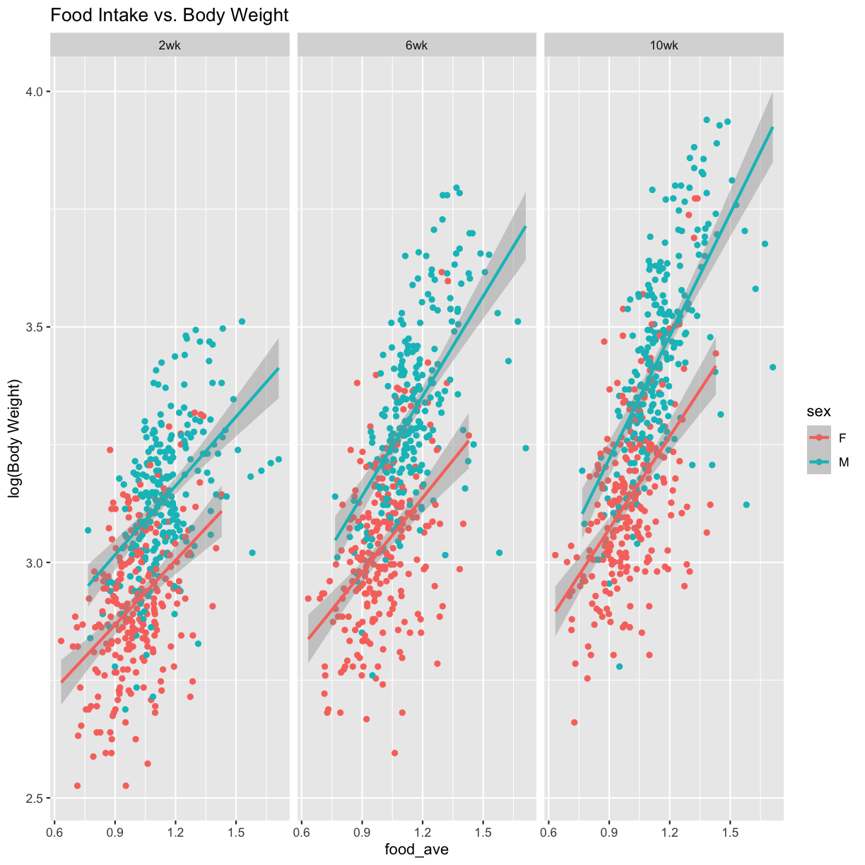
Weight vs. Food Intake
pheno_clin_log %>%
  select(mouse, sex, food_ave:weight_10wk) %>%
  gather(phenotype, value, -mouse, -sex, -food_ave) %>%
  separate(phenotype, c("phenotype", "week")) %>%
  mutate(week = factor(week, levels = c("2wk", "6wk", "10wk"))) %>%
  ggplot(aes(food_ave, value, color = sex)) +
    geom_point() +
    geom_smooth(method = "lm") +
    labs(title = "Food Intake vs. Body Weight", y = "log(Body Weight)") +
    facet_wrap(~week)
model_fxn = function(df) { lm(value ~ sex*food_ave, data = df) }
tmp = pheno_clin_log %>%
  select(mouse, sex, food_ave:weight_10wk) %>%
  gather(phenotype, value, -mouse, -sex, -food_ave) %>%
  separate(phenotype, c("phenotype", "week")) %>%
  mutate(week = factor(week, levels = c("2wk", "6wk", "10wk"))) %>%
  group_by(week) %>%
  nest() %>%
  mutate(model = map(data, model_fxn)) %>%
  mutate(summ = map(model, tidy)) %>%
  unnest(summ) %>%
  filter(term != "(Intercept)") %>%
  mutate(p.adj = p.adjust(p.value))
Error in `mutate()`:
! Problem while computing `summ = map(model, tidy)`.
ℹ The error occurred in group 1: week = 2wk.
Caused by error in `as_mapper()`:
! object 'tidy' not found
# kable(tmp, caption = "Effects of Sex and Food Intake on Body Weight")
Correlation Plots
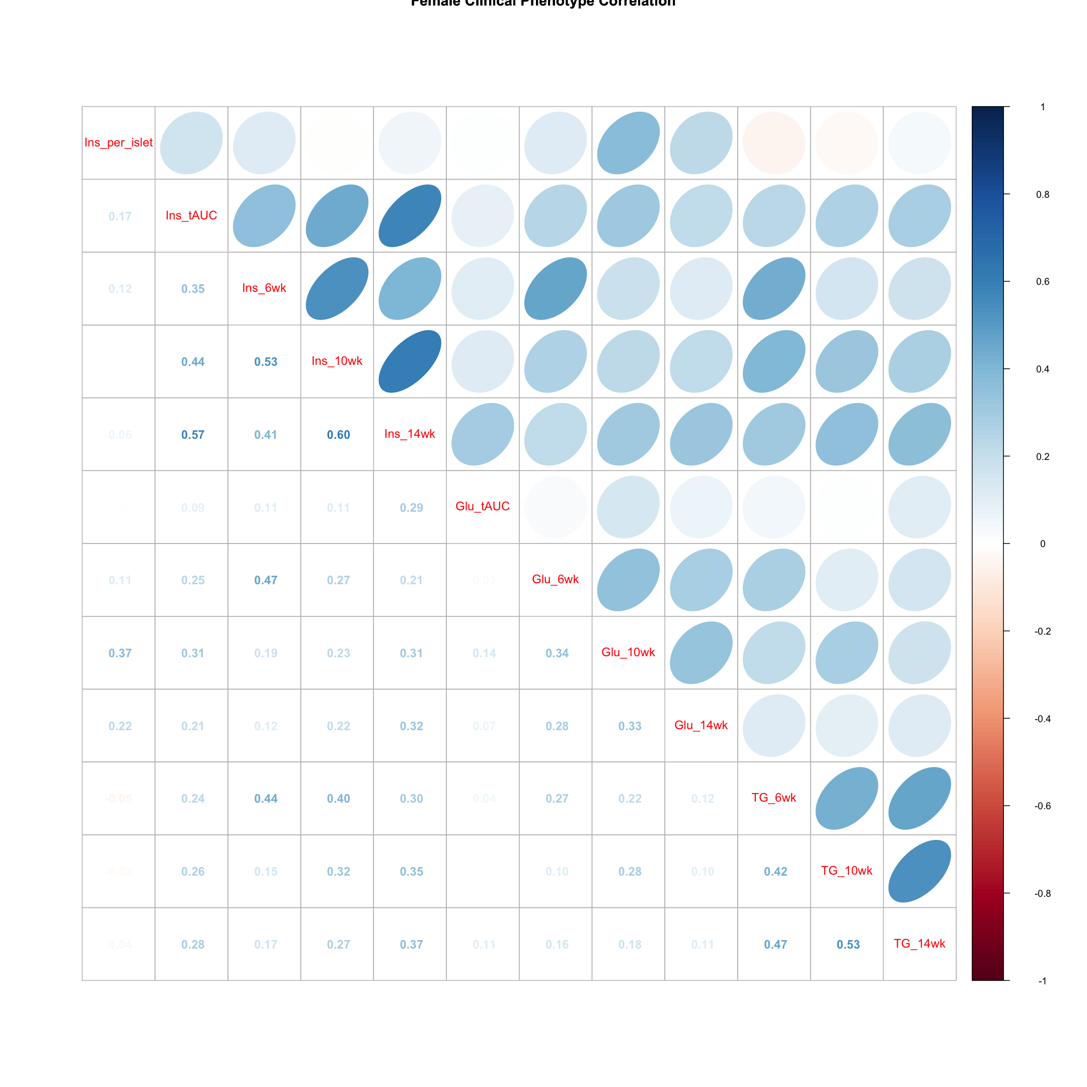
Females
tmp = pheno_clin_log %>%
        filter(sex == "F") %>%
        select(starts_with(c("Ins", "Glu", "TG")))
tmp = cor(tmp, use = "pairwise")
corrplot.mixed(tmp, upper = "ellipse", lower = "number",
               main = "Female Clinical Phenotype Correlation")
corrplot.mixed(tmp, upper = "ellipse", lower = "number",
               main = "Female Clinical Phenotype Correlation")
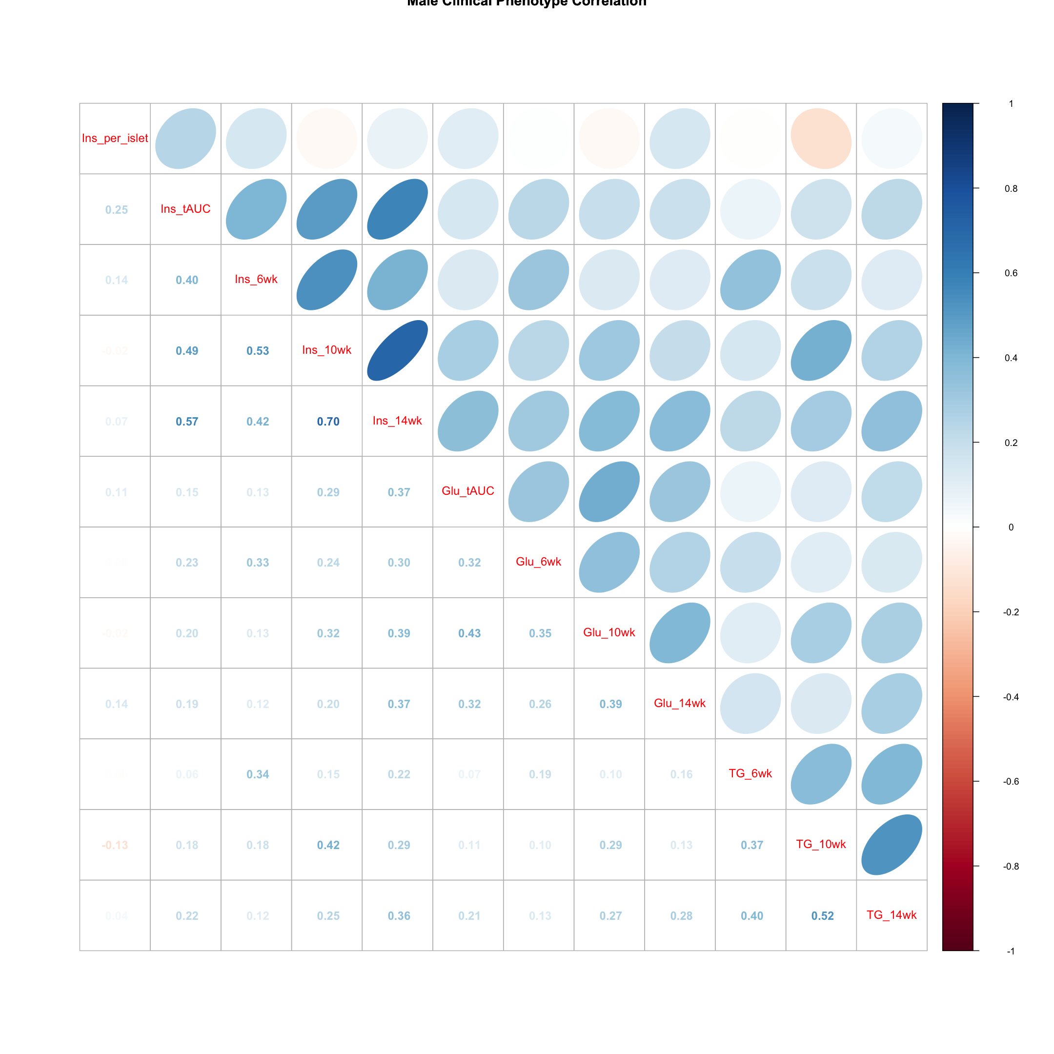
Males
tmp = pheno_clin_log %>%
        filter(sex == "M") %>%
        select(starts_with(c("Ins", "Glu", "TG")))
tmp = cor(tmp, use = "pairwise")
corrplot.mixed(tmp, upper = "ellipse", lower = "number",
               main = "Male Clinical Phenotype Correlation")
corrplot.mixed(tmp, upper = "ellipse", lower = "number",
               main = "Male Clinical Phenotype Correlation")
Gene Expression Phenotypes
# load the expression data along with annotations and metadata
load("../data/dataset.islet.rnaseq.RData")
names(dataset.islet.rnaseq)
[1] "annots"        "covar"         "covar.factors" "datatype"
[5] "display.name"  "expr"          "lod.peaks"     "raw"
[9] "samples"
# look at gene annotations
dataset.islet.rnaseq$annots[1:6,]
                              gene_id symbol chr     start       end strand
ENSMUSG00000000001 ENSMUSG00000000001  Gnai3   3 108.10728 108.14615     -1
ENSMUSG00000000028 ENSMUSG00000000028  Cdc45  16  18.78045  18.81199     -1
ENSMUSG00000000037 ENSMUSG00000000037  Scml2   X 161.11719 161.25821      1
ENSMUSG00000000049 ENSMUSG00000000049   Apoh  11 108.34335 108.41440      1
ENSMUSG00000000056 ENSMUSG00000000056   Narf  11 121.23725 121.25586      1
ENSMUSG00000000058 ENSMUSG00000000058   Cav2   6  17.28119  17.28911      1
                      middle nearest.marker.id        biotype      module
ENSMUSG00000000001 108.12671       3_108090236 protein_coding   darkgreen
ENSMUSG00000000028  18.79622       16_18817262 protein_coding        grey
ENSMUSG00000000037 161.18770       X_161182677 protein_coding        grey
ENSMUSG00000000049 108.37887      11_108369225 protein_coding greenyellow
ENSMUSG00000000056 121.24655      11_121200487 protein_coding       brown
ENSMUSG00000000058  17.28515        6_17288298 protein_coding       brown
                   hotspot
ENSMUSG00000000001    <NA>
ENSMUSG00000000028    <NA>
ENSMUSG00000000037    <NA>
ENSMUSG00000000049    <NA>
ENSMUSG00000000056    <NA>
ENSMUSG00000000058    <NA>
# look at raw counts
dataset.islet.rnaseq$raw[1:6,1:6]
      ENSMUSG00000000001 ENSMUSG00000000028 ENSMUSG00000000037
DO021              10247                108                 29
DO022              11838                187                 35
DO023              12591                160                 19
DO024              12424                216                 30
DO025              10906                 76                 21
DO026              12248                110                 34
      ENSMUSG00000000049 ENSMUSG00000000056 ENSMUSG00000000058
DO021                 15                120                703
DO022                 18                136                747
DO023                 18                275               1081
DO024                 81                160                761
DO025                  7                163                770
DO026                 18                204                644
# look at sample metadata
# summarize mouse sex, birth dates and DO waves
table(dataset.islet.rnaseq$samples[, c("sex", "birthdate")])
   birthdate
sex 2014-05-29 2014-10-15 2015-02-25 2015-09-22
  F         46         46         49         47
  M         45         48         50         47
table(dataset.islet.rnaseq$samples[, c("sex", "DOwave")])
   DOwave
sex  1  2  3  4  5
  F 46 46 49 47  0
  M 45 48 50 47  0
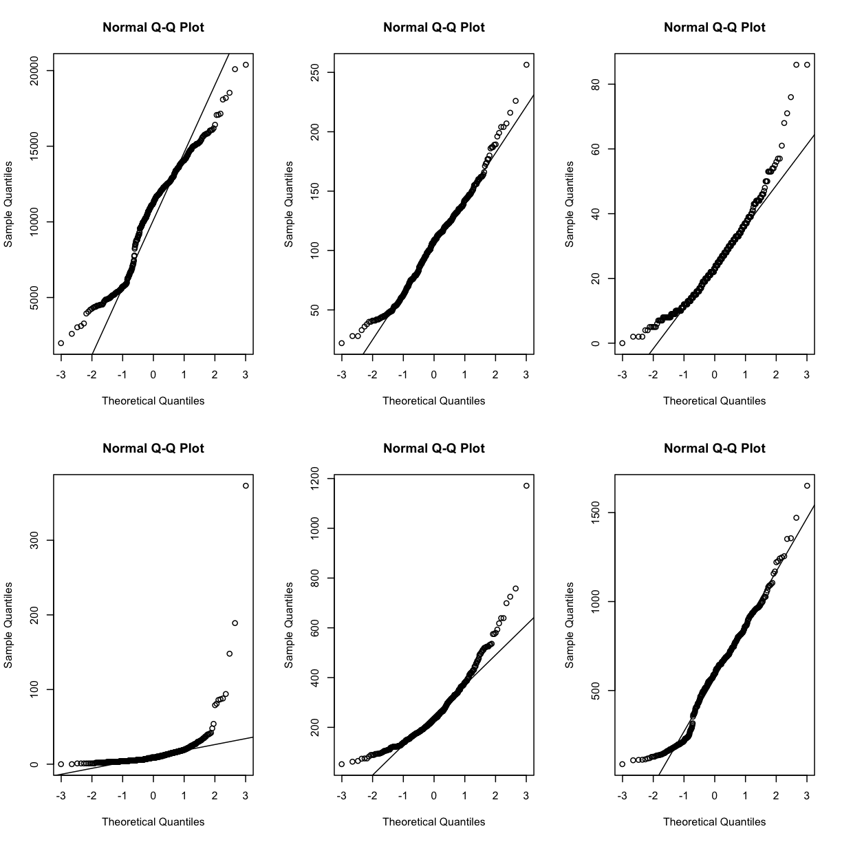
In order to make reasonable gene comparisons between samples, the count data need to be normalized. In the quantile-quantile (Q-Q) plot below, count data for the first gene are plotted over a diagonal line tracing a normal distribution for those counts. Notice that most of the count data values lie off of this line, indicating that these gene counts are not normally distributed.
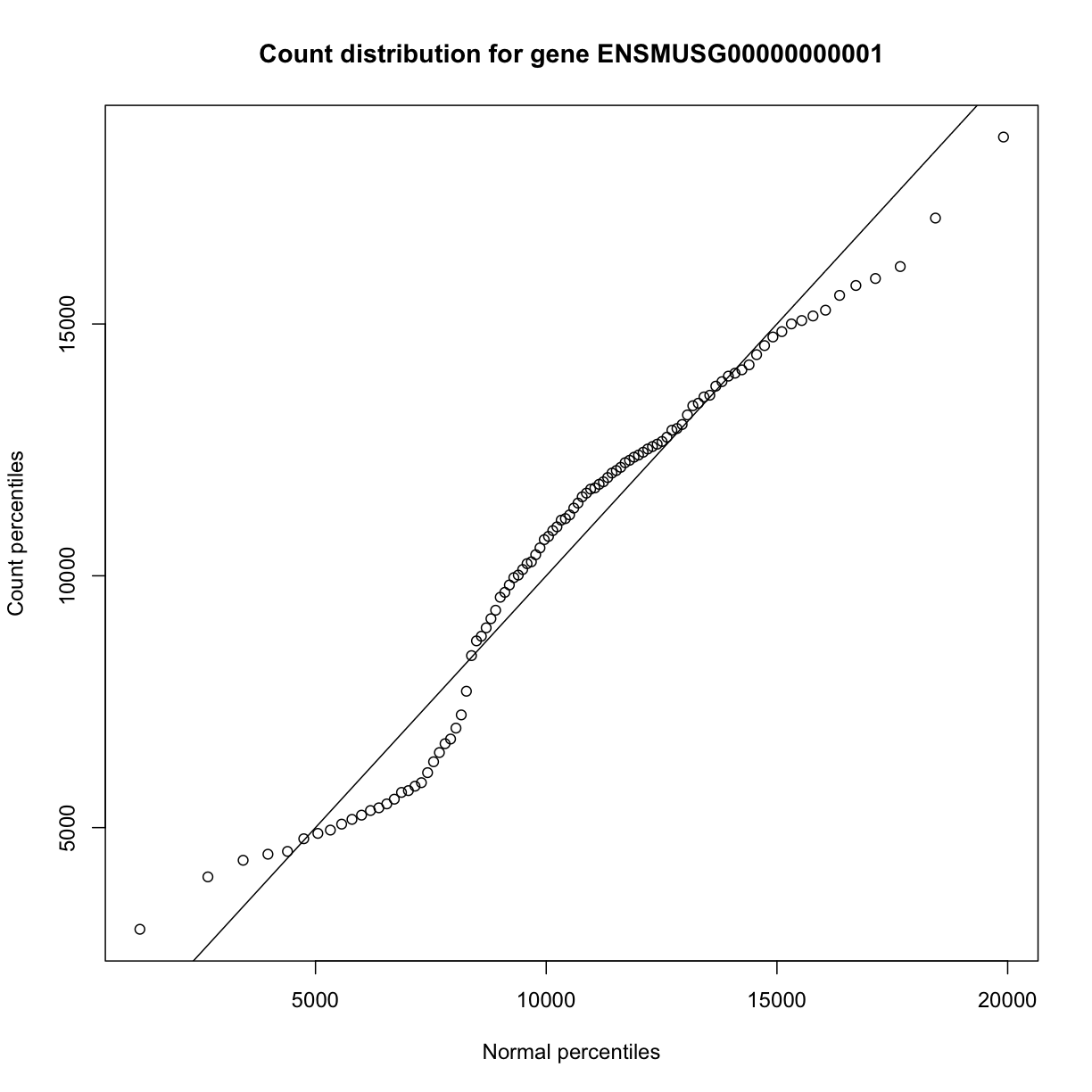
The same plot can be drawn as shown below. The diagonal line represents a standard normal distribution with mean 0 and standard deviation 1. Count data values are plotted against this standard normal distribution.
qqnorm(dataset.islet.rnaseq$raw[,1],
     xlab="Theoretical normal percentiles",
     ylab="Count percentiles",
     main="Count distribution for gene ENSMUSG00000000001")
qqline(dataset.islet.rnaseq$raw[,1])
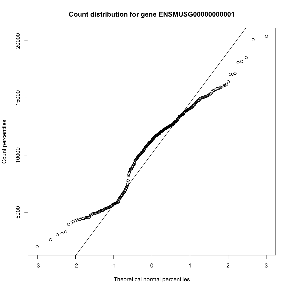
Q-Q plots for the first six genes show that count data for these genes are not normally distributed. They are also not on the same scale. The y-axis values for each subplot range to 20,000 counts in the first subplot, 250 in the second, 80 in the third, and so on.
par(mfrow=c(2,3))
for (i in 1:6) {
  qqnorm(dataset.islet.rnaseq$raw[,i])
  qqline(dataset.islet.rnaseq$raw[,i])
  }
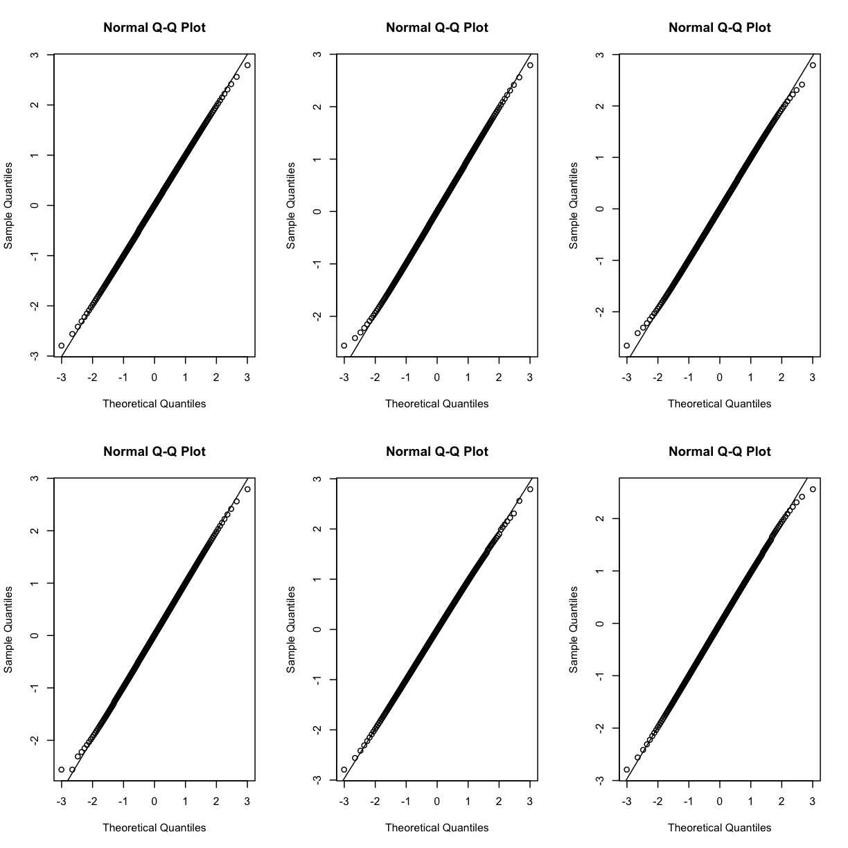
Q-Q plots of the normalized expression data for the first six genes show that the data values match the diagonal line well, meaning that they are now normally distributed. They are also all on the same scale now as well.
par(mfrow=c(2,3))
for (i in 1:6) {
  qqnorm(dataset.islet.rnaseq$expr[,i])
  qqline(dataset.islet.rnaseq$expr[,i])
  }
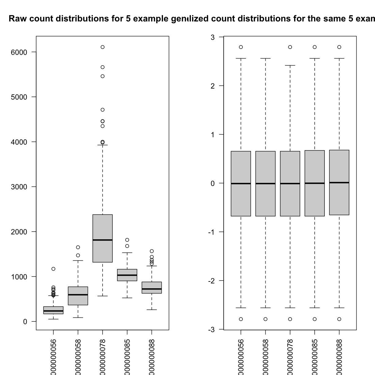
Boxplots of raw counts for 5 example genes are shown at left below. Notice that the median count values (horizontal black bar in each boxplot) are not comparable between the genes because the counts are not on the same scale. At right, boxplots for the same 5 genes show normalized count data on the same scale.
par(las=2, mfrow=c(1,2))
boxplot(dataset.islet.rnaseq$raw[,c(5:9)],
        main="Raw count distributions for 5 example genes")
boxplot(dataset.islet.rnaseq$expr[,c(5:9)],
        main="Normalized count distributions for the same 5 example genes")
# look at normalized counts
dataset.islet.rnaseq$expr[1:6,1:6]
      ENSMUSG00000000001 ENSMUSG00000000028 ENSMUSG00000000037
DO021        -0.09858728         0.19145703          0.5364855
DO022         0.97443030         2.41565800          1.1599398
DO023         0.75497867         1.62242658         -0.4767954
DO024         1.21299720         2.79216889          0.7205211
DO025         1.62242658        -0.27918258          0.3272808
DO026         0.48416010         0.03281516          0.8453674
      ENSMUSG00000000049 ENSMUSG00000000056 ENSMUSG00000000058
DO021         0.67037652         -1.4903750          0.6703765
DO022         1.03980755         -1.1221937          0.9744303
DO023         0.89324170          0.2317220          1.8245906
DO024         2.15179362         -0.7903569          0.9957498
DO025        -0.03281516         -0.2587715          1.5530179
DO026         0.86427916         -0.3973634          0.2791826
The expression data loaded provides LOD peaks for the eQTL analyses performed in this study. As a preview of what you will be doing next, extract the LOD peaks for chromosome 11.
# look at LOD peaks
dataset.islet.rnaseq$lod.peaks[1:6,]
            annot.id   marker.id chrom        pos       lod
1 ENSMUSG00000037922 3_136728699     3 136.728699 11.976856
2 ENSMUSG00000037926 2_164758936     2 164.758936  7.091543
3 ENSMUSG00000037926 5_147178504     5 147.178504  6.248598
4 ENSMUSG00000037933 5_147253583     5 147.253583  8.581871
5 ENSMUSG00000037933  13_6542783    13   6.542783  6.065497
6 ENSMUSG00000037935 11_99340415    11  99.340415  8.089051
# look at chromosome 11 LOD peaks
chr11_peaks <- dataset.islet.rnaseq$annots %>%
   select(gene_id, chr) %>%
   filter(chr=="11") %>%
   left_join(dataset.islet.rnaseq$lod.peaks,
             by = c("chr" = "chrom", "gene_id" = "annot.id"))

# look at the first several rows of chromosome 11 peaks
head(chr11_peaks)
             gene_id chr    marker.id       pos       lod
1 ENSMUSG00000000049  11 11_109408556 109.40856  8.337996
2 ENSMUSG00000000056  11 11_121434933 121.43493 11.379449
3 ENSMUSG00000000093  11  11_74732783  74.73278  9.889119
4 ENSMUSG00000000120  11  11_95962181  95.96218 11.257591
5 ENSMUSG00000000125  11         <NA>        NA        NA
6 ENSMUSG00000000126  11  11_26992236  26.99224  6.013533
# how many rows?
dim(chr11_peaks)
[1] 1810 5
# how many rows have LOD scores?
chr11_peaks %>% filter(!is.na(lod)) %>% dim()
[1] 1208 5
# sort chromosome 11 peaks by LOD score
chr11_peaks %>% arrange(desc(lod)) %>% head()
             gene_id chr   marker.id      pos      lod
1 ENSMUSG00000020268  11 11_55073940 55.07394 189.2332
2 ENSMUSG00000020333  11 11_53961279 53.96128 147.8134
3 ENSMUSG00000017404  11 11_98062374 98.06237 136.0430
4 ENSMUSG00000093483  11 11_83104215 83.10421 135.1067
5 ENSMUSG00000058546  11 11_78204410 78.20441 132.3365
6 ENSMUSG00000078695  11 11_97596132 97.59613 131.8005
# range of LOD scores and positions
range(chr11_peaks$lod, na.rm = TRUE)
[1] 6.000975 189.233211
range(chr11_peaks$pos, na.rm = TRUE)
[1] 3.126009 122.078650
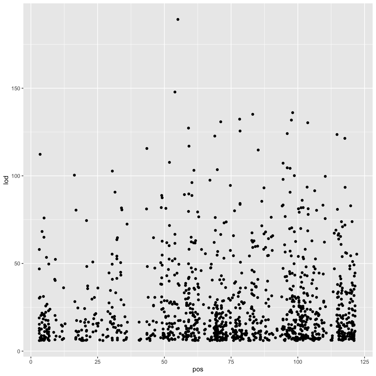
# view LOD scores by position
chr11_peaks %>% arrange(desc(lod)) %>%
  ggplot(aes(pos, lod)) + geom_point()
Warning: Removed 602 rows containing missing values (geom_point).
Key Points
Review Mapping Steps
Overview
Teaching: 30 min
Exercises: 30 minQuestions
What are the steps involved in running QTL mapping in Diversity Outbred mice?
Objectives
Reviewing the QTL mapping steps learnt in the first two days
Before we begin to run QTL mapping on gene expression data to find eQTLs, let’s review the main QTL mapping steps that we learnt in the QTL mapping course. As a reminder, we are using data from the Keller et al. paper that are freely available to download.
Make sure that you are in your main directory. If you’re not sure where you are working right now, you can check your working directory with getwd(). If you are not in your main directory, run setwd("code") in the Console or Session -> Set Working Directory -> Choose Directory in the RStudio menu to set your working directory to the code directory.
Load Libraries
Below are the neccessary libraries that we require for this review. They are already installed on your machines so go ahead an load them using the following code:
library(tidyverse)
library(knitr)
library(broom)
library(qtl2)
Load Data
The data for this tutorial has been saved as several R binary files which contain several data objects, including phenotypes and mapping data as well as the genoprobs.
Load the data in now by running the following command in your new script.
##phenotypes
load("../data/attie_DO500_clinical.phenotypes.RData")

##mapping data
load("../data/attie_DO500_mapping.data.RData")

##genotype probabilities
probs = readRDS("../data/attie_DO500_genoprobs_v5.rds")
We loaded in a few data objects today. Check the Environment tab to see what was loaded. You should see a phenotypes object called pheno_clin with 500 observations (in rows) of 32 variables (in columns), an object called map (physical map), and an object called probs (genotype probabilities).
Phenotypes
In this data set, we have 20 phenotypes for 500 Diversity Outbred mice. pheno_clin is a data frame containing the phenotype data as well as covariate information. Click on the triangle to the left of pheno_clin in the Environment pane to view its contents. Run names(pheno_clin) to list the variables.
pheno_clin_dict is the phenotype dictionary. This data frame contains information on each variable in pheno_clin, including name,short name, pheno_type, formula (if used) and description.
Since the paper is interested in type 2 diabetes and insulin secretion, we will choose insulin tAUC (area under the curve (AUC) which was calculated without any correction for baseline differences) for this review
Many statistical models, including the QTL mapping model in qtl2, expect that the incoming data will be normally distributed. You may use transformations such as log or square root to make your data more normally distributed. Here, we will log transform the data.
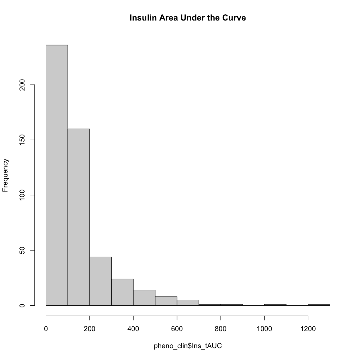
Here is a histogram of the untransformed data.
hist(pheno_clin$Ins_tAUC, main = "Insulin Area Under the Curve")
Now, let’s apply the log() function to this data to correct the distribution.
pheno_clin$Ins_tAUC_log <- log(pheno_clin$Ins_tAUC)
Now, let’s make a histogram of the log-transformed data.
hist(pheno_clin$Ins_tAUC_log, main = "insulin tAUC (log-transformed)")
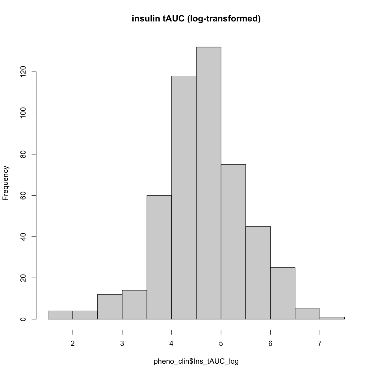
This looks much better!
The Marker Map
The marker map for each chromosome is stored in the map object. This is used to plot the LOD scores calculated at each marker during QTL mapping. Each list element is a numeric vector with each marker position in megabases (Mb). Here we are using the 69K grid marker file. Often when there are numerous genotype arrays used in a study, we interoplate all to a 69k grid file so we are able to combine all samples across different array types.
Look at the structure of map in the Environment tab by clicking the triangle to the left or by running str(map) in the Console.
Genotype probabilities
Each element of probs is a 3 dimensional array containing the founder allele dosages for each sample at each marker on one chromosome. These are the 8 state alelle probabilities (not 32) using the 69k marker grid for same 500 DO mice that also have clinical phenotypes. We have already calculated genotype probabilities for you, so you can skip the step for calculating genotype probabilities and the optional step for calculating allele probabilities.
Next, we look at the dimensions of probs for chromosome 1:
dim(probs[[1]])
[1] 500 8 4711
plot_genoprob(probs, map, ind = 1, chr = 1)
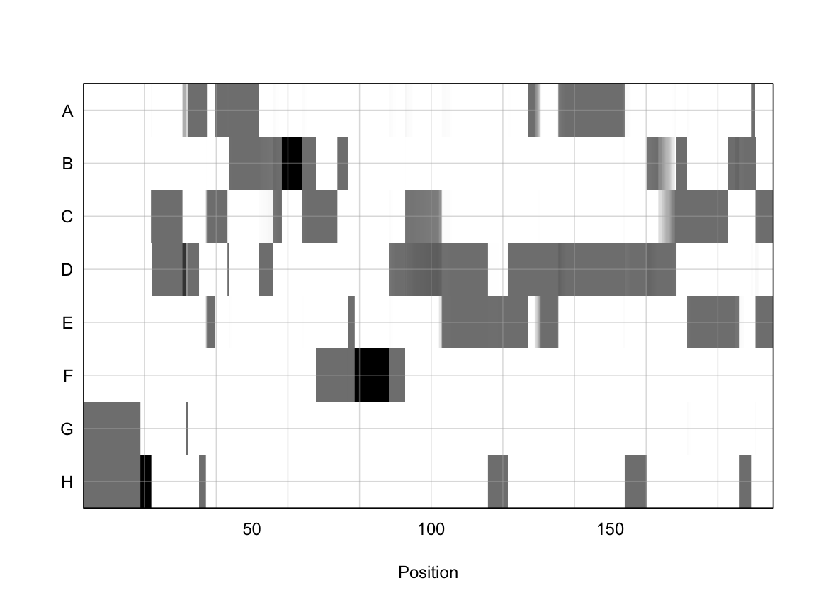
In the plot above, the founder contributions, which range between 0 and 1, are colored from white (= 0) to black (= 1.0). A value of ~0.5 is grey. The markers are on the X-axis and the eight founders (denoted by the letters A through H) on the Y-axis. Starting at the left, we see that this sample has genotype GH because the rows for G & H are grey, indicating values of 0.5 for both alleles. Moving along the genome to the right, the genotype becomes HH where where the row is black indicating a value of 1.0. This is followed by CD, DD, DG, AD, AH, CE, etc. The values at each marker sum to 1.0.
Kinship Matrix
The kinship matrix has already been calculated and loaded in above
n_samples <- 50
heatmap(K[[1]][1:n_samples, 1:n_samples])
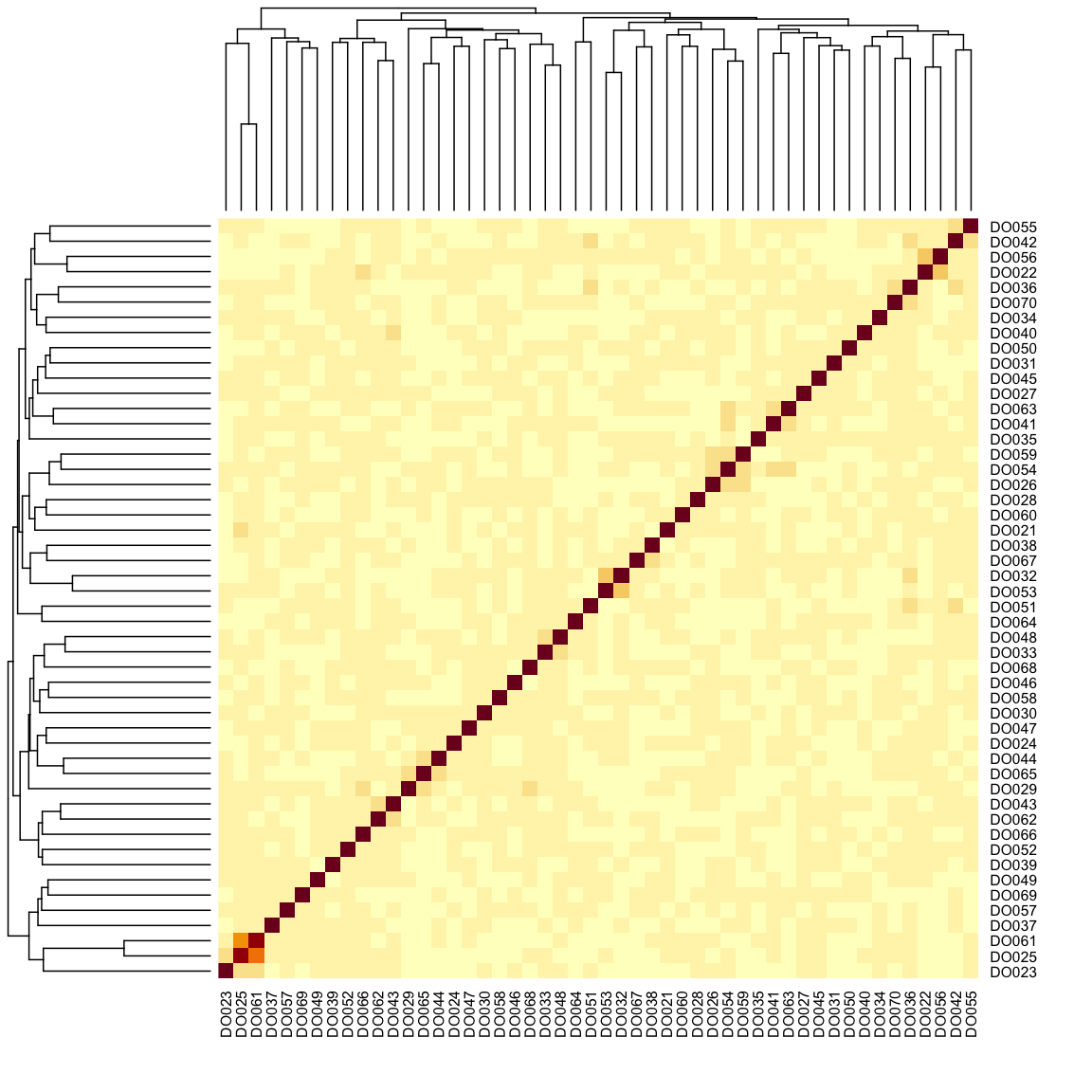
The figure above shows kinship between all pairs of samples. Light yellow indicates low kinship and dark red indicates higher kinship. Orange values indicate varying levels of kinship between 0 and 1. The dark red diagonal of the matrix indicates that each sample is identical to itself. The orange blocks along the diagonal may indicate close relatives (i.e. siblings or cousins).
Covariates
Next, we need to create additive covariates that will be used in the mapping model. First, we need to see which covariates are significant. In the data set, we have sex, DOwave (Wave (i.e., batch) of DO mice)
and diet_days (number of days on diet) to test whether there are any gender, batch or diet effects.
First we are going to select out the covariates and phenotype we want from pheno_clin data frame. Then reformat these selected variables into a long format (using the gather command) grouped by the phenotypes (in this case, we only have Ins_tAUC_log)
### Tests for sex, wave and diet_days.

tmp = pheno_clin %>%
        dplyr::select(mouse, sex, DOwave, diet_days, Ins_tAUC_log) %>%
        gather(phenotype, value, -mouse, -sex, -DOwave, -diet_days) %>%
        group_by(phenotype) %>%
        nest()
Let’s create a linear model function that will regress the covariates and the phenotype.
mod_fxn = function(df) {
  lm(value ~ sex + DOwave + diet_days, data = df)
}
Now let’s apply that function to the data object tmp that we created above.
tmp = tmp %>%
  mutate(model = map(data, mod_fxn)) %>%
  mutate(summ = map(model, tidy)) %>%
  unnest(summ)

tmp
# A tibble: 7 × 8
# Groups: phenotype [1]
phenotype data model term estimate std.e…¹ stati…² p.value
<chr> <list> <list> <chr> <dbl> <dbl> <dbl> <dbl>
1 Ins_tAUC_log <tibble [500 × 5]> <lm> (Int… 4.49 0.447 10.1 1.10e-21
2 Ins_tAUC_log <tibble [500 × 5]> <lm> sexM 0.457 0.0742 6.17 1.48e- 9
3 Ins_tAUC_log <tibble [500 × 5]> <lm> DOwa… -0.294 0.118 -2.49 1.33e- 2
4 Ins_tAUC_log <tibble [500 × 5]> <lm> DOwa… -0.395 0.118 -3.36 8.46e- 4
5 Ins_tAUC_log <tibble [500 × 5]> <lm> DOwa… -0.176 0.118 -1.49 1.38e- 1
6 Ins_tAUC_log <tibble [500 × 5]> <lm> DOwa… -0.137 0.118 -1.16 2.46e- 1
7 Ins_tAUC_log <tibble [500 × 5]> <lm> diet… 0.00111 0.00346 0.322 7.48e- 1
# … with abbreviated variable names ¹std.error, ²statistic
tmp %>%
  filter(term != "(Intercept)") %>%
  mutate(neg.log.p = -log10(p.value)) %>%
  ggplot(aes(term, neg.log.p)) +
    geom_point() +
    facet_wrap(~phenotype) +
    labs(title = "Significance of Sex, Wave & Diet Days on Phenotypes") +
    theme(axis.text.x = element_text(angle = 90, hjust = 1, vjust = 0.5)) +
rm(tmp)
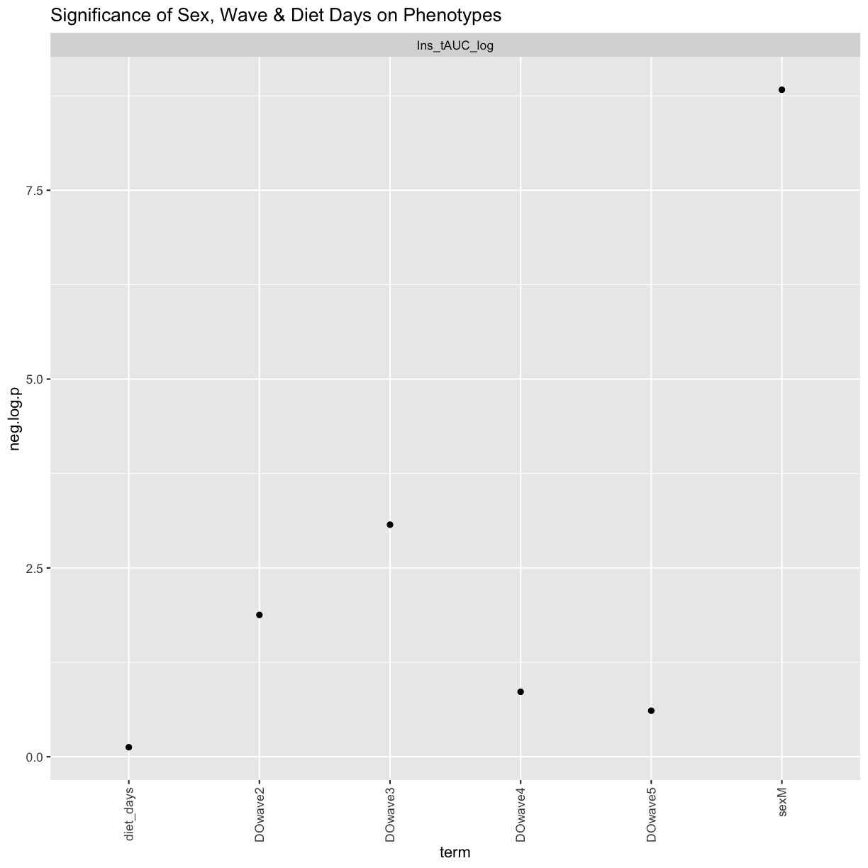
We can see that sex and DOwave (especially the third batch) are significant. Here DOwave is the group or batch number as not all mice are in the experient at the same time. Because of this, we now have to correct for it.
# convert sex and DO wave (batch) to factors
pheno_clin$sex = factor(pheno_clin$sex)
pheno_clin$DOwave = factor(pheno_clin$DOwave)

covar = model.matrix(~sex + DOwave, data = pheno_clin)
REMEMBER: the sample IDs must be in the rownames of pheno, addcovar, genoprobs and K. qtl2 uses the sample IDs to align the samples between objects.
Performing a genome scan
At each marker on the genotyping array, we will fit a model that regresses the phenotype (insulin secretion AUC) on covariates and the founder allele proportions. Note that this model will give us an estimate of the effect of each founder allele at each marker. There are eight founder strains that contributed to the DO, so we will get eight founder allele effects.
Now let’s perform the genome scan, using the scan1 function.
qtl = scan1(genoprobs = probs,
            pheno = pheno_clin[,"Ins_tAUC_log", drop = FALSE],
            kinship = K,
            addcovar = covar)
Next, we plot the genome scan.
plot_scan1(x = qtl, map = map, lodcolumn = "Ins_tAUC_log")
  abline(h = 6, col = 2, lwd = 2)
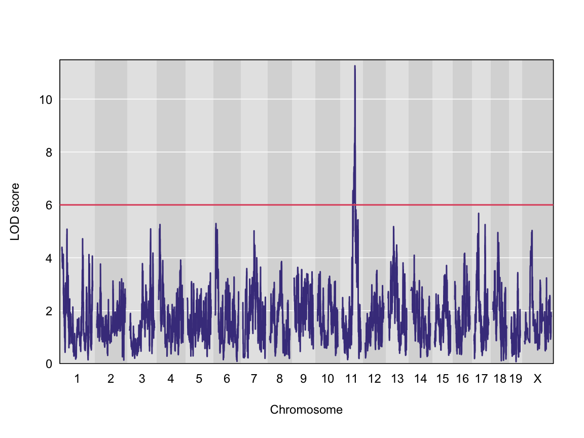
We can see a very strong peak on chromosome 11 with no other distibuishable peaks.
Finding LOD peaks
We can find all of the peaks above the significance threshold using the find_peaks function.
The support interval is determined using the Bayesian Credible Interval and represents the region most likely to contain the causative polymorphism(s). We can obtain this interval by adding a prob argument to find_peaks. We pass in a value of 0.95 to request a support interval that contains the causal SNP 95% of the time.
In case there are multiple peaks are found on a chromosome, the peakdrop argument allows us to the find the peak which has a certain LOD score drop between other peaks.
Let’s find LOD peaks. Here we are choosing to find peaks with a LOD score greater than 6.
lod_threshold = 6
peaks = find_peaks(scan1_output = qtl, map = map,
                   threshold = lod_threshold,
                   peakdrop = 4,
                   prob = 0.95)

kable(peaks %>% dplyr::select (-lodindex) %>%
        arrange(chr, pos), caption = "Phenotype QTL Peaks with LOD >= 6")
Table: Phenotype QTL Peaks with LOD >= 6
| lodcolumn | chr | pos | lod | ci_lo | ci_hi |
|---|---|---|---|---|---|
| Ins_tAUC_log | 11 | 83.59467 | 11.25884 | 83.58553 | 84.95444 |
Challenge
Now choose another phenotype in
pheno_clinand perform the same steps.
1). Check the distribution. Does it need transforming? If so, how would you do it? 2). Are there any sex, batch, diet effects?
3). Run a genome scan with the genotype probabilities and kinship provided.
4). Plot the genome scan for this phenotype.
5). Find the peaks above LOD score of 6.Solution
Replace
<pheno name>with your choice of phenotype#1). hist(pheno_clin$<pheno name>) pheno_clin$<pheno name>_log <- log(pheno_clin$<pheno name>) hist(pheno_clin$<pheno name>_log) #2). tmp = pheno_clin %>% dplyr::select(mouse, sex, DOwave, diet_days, <pheno name>) %>% gather(phenotype, value, -mouse, -sex, -DOwave, -diet_days) %>% group_by(phenotype) %>% nest() mod_fxn = function(df) { lm(value ~ sex + DOwave + diet_days, data = df) } tmp = tmp %>% mutate(model = map(data, mod_fxn)) %>% mutate(summ = map(model, tidy)) %>% unnest(summ) tmp tmp %>% filter(term != "(Intercept)") %>% mutate(neg.log.p = -log10(p.value)) %>% ggplot(aes(term, neg.log.p)) + geom_point() + facet_wrap(~phenotype) + labs(title = "Significance of Sex, Wave & Diet Days on Phenotypes") + theme(axis.text.x = element_text(angle = 90, hjust = 1, vjust = 0.5)) + rm(tmp) #3). qtl = scan1(genoprobs = probs, pheno = pheno_clin[,"<pheno name>", drop = FALSE], kinship = K, addcovar = covar) #4). plot_scan1(x = qtl, map = map, lodcolumn = "<pheno name>") abline(h = 6, col = 2, lwd = 2) #5). peaks = find_peaks(scan1_output = qtl, map = map, threshold = lod_threshold, peakdrop = 4, prob = 0.95)
Key Points
To understand the key steps running a QTL mapping analysis
Mapping A Single Gene Expression Trait
Overview
Teaching: 30 min
Exercises: 30 minQuestions
How do I map one gene expression trait?
Objectives
QTL mapping of an expression data set
In this tutorial, we are going to use the gene expression data as our phenotype to map QTLs. That is, we are looking to find any QTLs (cis or trans) that are responsible for variation in gene expression across samples.
We are using the same directory as our previous tutorial, which you can check by typing getwd() in the Console. If you are not in the correct directory, type in setwd("code") in the console or Session -> Set Working Directory -> Choose Directory in the RStudio menu to set your working directory to the main directory.
If you have started a new R session, you will need to load the libraries again. If you haven’t, the libraries listed below are already loaded.
Load Libraries
library(tidyverse)
library(knitr)
library(broom)
library(qtl2)
Load Data
In this lesson, we are loading in gene expression data for 21,771 genes: attie_DO500_expr.datasets.RData that includes normalised and raw gene expression data. dataset.islet.rnaseq is the dataset you can download directly from Dryad. Again, if you are using the same R session, you will not need to the load the mapping, phenotypes and genotype probabilities data, again.
# expression data
load("../data/attie_DO500_expr.datasets.RData")

# data from paper
load("../data/dataset.islet.rnaseq.RData")

# phenotypes
load("../data/attie_DO500_clinical.phenotypes.RData")

# mapping data
load("../data/attie_DO500_mapping.data.RData")

# genotype probabilities
probs = readRDS("../data/attie_DO500_genoprobs_v5.rds")
Expression Data
Raw gene expression counts are in the counts data object. These counts have been normalised and saved in the norm data object. More information is about normalisation is here.
To view the contents of either one of these data , click the table on the right hand side either norm or counts in the Environment tab. If you type in names(counts), you will see the names all start with ENSMUSG. These are Ensembl IDs. If we want to see which gene these IDs correspond to, type in dataset.islet.rnaseq$annots[dataset.islet.rnaseq$annots, which gives information about each gene, including ensemble id, gene symbol as well as start & stop location of the gene and chromsome on which the gene lies.
Because we are working with the insulin tAUC phenotype, let’s map the expression counts for Hnf1b which is known to influence this phenotype is these data. First, we need to find the Ensembl ID for this gene:
dataset.islet.rnaseq$annots[dataset.islet.rnaseq$annots$symbol == "Hnf1b",]
                              gene_id symbol chr    start      end strand
ENSMUSG00000020679 ENSMUSG00000020679  Hnf1b  11 83.85006 83.90592      1
                     middle nearest.marker.id        biotype       module
ENSMUSG00000020679 83.87799       11_84097611 protein_coding midnightblue
                   hotspot
ENSMUSG00000020679    <NA>
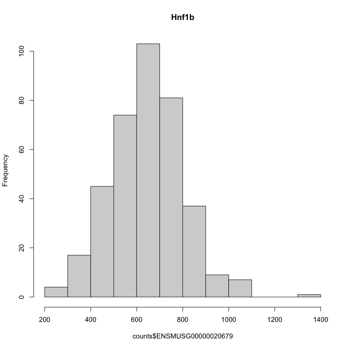
We can see that the ensembl ID of Hnf1b is ENSMUSG00000020679. If we check the distribution for Hnf1b expression data between the raw and normalised data, we can see there distribution has been corrected. Here is the distribution of the raw counts:
hist(counts$ENSMUSG00000020679, main = "Hnf1b")
and here is the distribution of the normalised counts:
hist(norm$ENSMUSG00000020679, main = "Hnf1b")
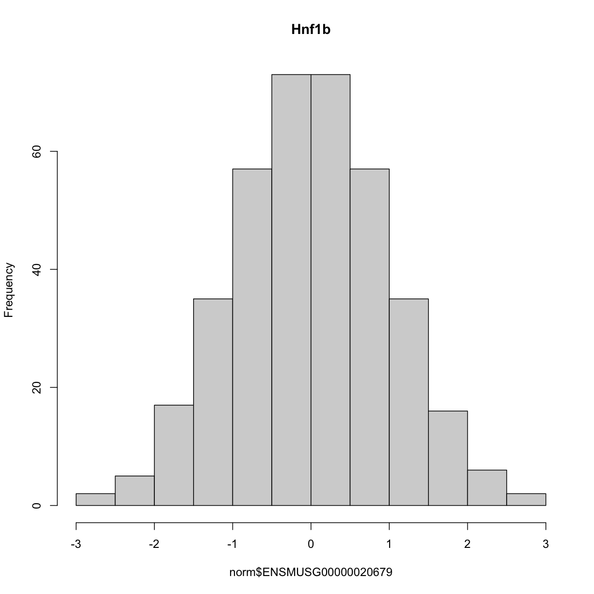
The histogram indicates that distribution of these counts are normalised.
The Marker Map
We are using the same marker map as in the previous lesson
Genotype probabilities
We have explored this earlier in th previous lesson. But, as a reminder, we have already calculated genotype probabilities which we loaded above called probs. This contains the 8 state genotype probabilities using the 69k grid map of the same 500 DO mice that also have clinical phenotypes.
Kinship Matrix
We have explored the kinship matrix in the previous lesson. It has already been calculated and loaded in above.
Covariates
Now let’s add the necessary covariates. For Hnf1b expression data, let’s see which covariates are significant.
###merging covariate data and expression data to test for sex, wave and diet_days.

cov.counts <- merge(covar, norm, by=c("row.names"), sort=F)

#testing covairates on expression data

tmp = cov.counts %>%
        dplyr::select(mouse, sex, DOwave, diet_days, ENSMUSG00000020679) %>%
        gather(expression, value, -mouse, -sex, -DOwave, -diet_days) %>%
        group_by(expression) %>%
        nest()
mod_fxn = function(df) {
  lm(value ~ sex + DOwave + diet_days, data = df)
}
tmp = tmp %>%
  mutate(model = map(data, mod_fxn)) %>%
  mutate(summ = map(model, tidy)) %>%
  unnest(summ)
#  kable(tmp, caption = "Effects of Sex, Wave & Diet Days on Expression")

tmp
# A tibble: 4 × 8
# Groups: expression [1]
expression data model term estimate std.e…¹ stati…² p.value
<chr> <list> <list> <chr> <dbl> <dbl> <dbl> <dbl>
1 ENSMUSG00000020679 <tibble> <lm> (Interce… -1.70 0.506 -3.36 8.72e- 4
2 ENSMUSG00000020679 <tibble> <lm> sexM -0.199 0.0824 -2.42 1.60e- 2
3 ENSMUSG00000020679 <tibble> <lm> DOwave 0.510 0.0370 13.8 3.73e-35
4 ENSMUSG00000020679 <tibble> <lm> diet_days 0.00403 0.00386 1.04 2.97e- 1
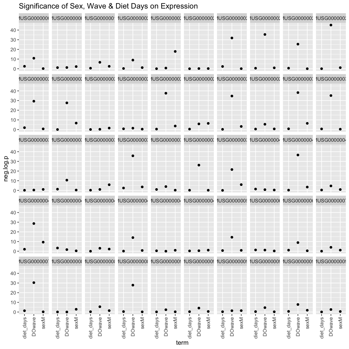
# … with abbreviated variable names ¹std.error, ²statistic
tmp %>%
  filter(term != "(Intercept)") %>%
  mutate(neg.log.p = -log10(p.value)) %>%
  ggplot(aes(term, neg.log.p)) +
    geom_point() +
    facet_wrap(~expression) +
    labs(title = "Significance of Sex, Wave & Diet Days on Expression") +
    theme(axis.text.x = element_text(angle = 90, hjust = 1, vjust = 0.5)) +
rm(tmp)
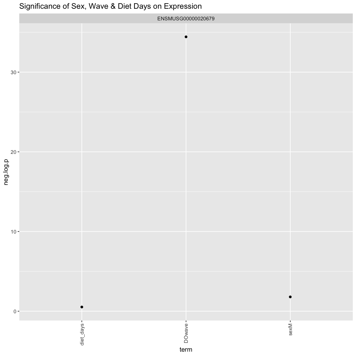
We can see that sex and DOwave are significant. Here DOwave is the group or batch number as not all mice were submitted for genotyping at the same time. Because of this, we now have to correct for it.
# convert sex and DO wave (batch) to factors
pheno_clin$sex = factor(pheno_clin$sex)
pheno_clin$DOwave = factor(pheno_clin$DOwave)
pheno_clin$diet_days = factor(pheno_clin$DOwave)

covar = model.matrix(~sex + DOwave + diet_days, data = pheno_clin)
Performing a genome scan
Now let’s perform the genome scan!
qtl = scan1(genoprobs = probs,
            pheno = norm[,"ENSMUSG00000020679", drop = FALSE],
            kinship = K,
            addcovar = covar,
            cores = 2)
Let’s plot it
plot_scan1(x = qtl,
           map = map,
           lodcolumn = "ENSMUSG00000020679",
           main = colnames(qtl))
abline(h = 6, col = 2, lwd = 2)
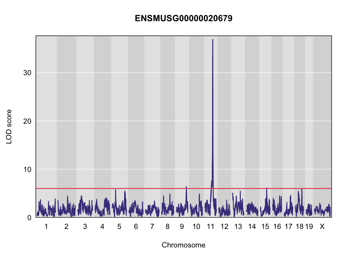
Finding LOD peaks
Let’s find LOD peaks
lod_threshold = 6
peaks = find_peaks(scan1_output = qtl,
                   map = map,
                   threshold = lod_threshold,
                   peakdrop = 4, prob = 0.95)
kable(peaks %>%
        dplyr::select(-lodindex) %>%
        arrange(chr, pos), caption = "Phenotype QTL Peaks with LOD >= 6")
Table: Phenotype QTL Peaks with LOD >= 6
| lodcolumn | chr | pos | lod | ci_lo | ci_hi |
|---|---|---|---|---|---|
| ENSMUSG00000020679 | 9 | 109.08150 | 6.402594 | 106.66772 | 111.56048 |
| ENSMUSG00000020679 | 11 | 84.40138 | 36.878942 | 83.64714 | 84.40138 |
| ENSMUSG00000020679 | 15 | 68.91018 | 6.121254 | 67.82232 | 70.38004 |
| ENSMUSG00000020679 | 18 | 70.89669 | 6.042135 | 33.80428 | 71.96869 |
Challenge
Now choose another gene expression trait in
normdata object and perform the same steps.
1). Check the distribution of the raw counts and normalised counts 2). Are there any sex, batch, diet effects?
3). Run a genome scan with the genotype probabilities and kinship provided.
4). Plot the genome scan for this gene.
5). Find the peaks above LOD score of 6.Solution
Replace
<ensembl id>with your choice of gene expression trait#1). hist(pheno_clin$<ensembl id>) pheno_clin$<ensembl id>_log <- log(pheno_clin$<ensembl id>) hist(pheno_clin$<ensembl id>_log) #2). tmp = pheno_clin %>% dplyr::select(mouse, sex, DOwave, diet_days, <ensembl id>) %>% gather(expression, value, -mouse, -sex, -DOwave, -diet_days) %>% group_by(expression) %>% nest() mod_fxn = function(df) { lm(value ~ sex + DOwave + diet_days, data = df) } tmp = tmp %>% mutate(model = map(data, mod_fxn)) %>% mutate(summ = map(model, tidy)) %>% unnest(summ) tmp tmp %>% filter(term != "(Intercept)") %>% mutate(neg.log.p = -log10(p.value)) %>% ggplot(aes(term, neg.log.p)) + geom_point() + facet_wrap(~expression) + labs(title = "Significance of Sex, Wave & Diet Days on Phenotypes") + theme(axis.text.x = element_text(angle = 90, hjust = 1, vjust = 0.5)) + rm(tmp) #3). qtl = scan1(genoprobs = probs, pheno = pheno_clin[,"<ensembl id>", drop = FALSE], kinship = K, addcovar = covar) #4). plot_scan1(x = qtl, map = map, lodcolumn = "<ensembl id>") abline(h = 6, col = 2, lwd = 2) #5). peaks = find_peaks(scan1_output = qtl, map = map, threshold = lod_threshold, peakdrop = 4, prob = 0.95)
Key Points
To run a QTL analysis for expression data
Mapping Many Gene Expression Traits
Overview
Teaching: 30 min
Exercises: 30 minQuestions
How do I map many genes?
Objectives
To map several genes at the same time
Load Libraries
library(tidyverse)
library(knitr)
library(broom)
library(qtl2)
library(qtl2ggplot)
library(RColorBrewer)

source("../code/gg_transcriptome_map.R")
source("../code/qtl_heatmap.R")
Before we begin this lesson, we need to create another directory called results in our main directory. You can do this by clicking on the “Files” tab and navigate into the main directory. Then select “New Folder” and name it “results”.
Load Data
# expression data
load("../data/attie_DO500_expr.datasets.RData")

# data from paper
load("../data/dataset.islet.rnaseq.RData")

# phenotypes
load("../data/attie_DO500_clinical.phenotypes.RData")

# mapping data
load("../data/attie_DO500_mapping.data.RData")

# genotype probabilities
probs = readRDS("../data/attie_DO500_genoprobs_v5.rds")
Data Selection
For this lesson, lets choose a random set of 50 gene expression phenotypes.
genes = colnames(norm)

sams <- sample(length(genes), 50, replace = FALSE, prob = NULL)
genes <- genes[sams]

gene.info <- dataset.islet.rnaseq$annots[genes,]
rownames(gene.info) = NULL
kable(gene.info)
| gene_id | symbol | chr | start | end | strand | middle | nearest.marker.id | biotype | module | hotspot |
|---|---|---|---|---|---|---|---|---|---|---|
| ENSMUSG00000048865 | Arhgap30 | 1 | 171.388954 | 171.410298 | 1 | 171.399626 | 1_171385294 | protein_coding | darkorange | NA |
| ENSMUSG00000035910 | Dcdc2a | 13 | 25.056004 | 25.210706 | 1 | 25.133355 | 13_25119107 | protein_coding | brown | chr7 |
| ENSMUSG00000022536 | Glyr1 | 16 | 5.013906 | 5.049910 | -1 | 5.031908 | 16_5060435 | protein_coding | yellow | NA |
| ENSMUSG00000014980 | Tsen15 | 1 | 152.370735 | 152.386688 | -1 | 152.378712 | 1_152383052 | protein_coding | turquoise | NA |
| ENSMUSG00000022668 | Gtpbp8 | 16 | 44.736768 | 44.746363 | -1 | 44.741566 | 16_44738910 | protein_coding | green | NA |
| ENSMUSG00000086968 | 4933431E20Rik | 3 | 107.888850 | 107.896213 | -1 | 107.892532 | 3_107868965 | processed_transcript | grey | NA |
| ENSMUSG00000027720 | Il2 | 3 | 37.120523 | 37.125959 | -1 | 37.123241 | 3_37117746 | protein_coding | grey | NA |
| ENSMUSG00000044948 | Wdr96 | 19 | 47.737561 | 47.919287 | -1 | 47.828424 | 19_47839103 | protein_coding | grey | NA |
| ENSMUSG00000027570 | Col9a3 | 2 | 180.597790 | 180.622189 | 1 | 180.609990 | 2_180571050 | protein_coding | magenta | NA |
| ENSMUSG00000068015 | Lrch1 | 14 | 74.754674 | 74.947877 | -1 | 74.851276 | 14_74853309 | protein_coding | skyblue3 | NA |
| ENSMUSG00000021749 | Oit1 | 14 | 8.348948 | 8.378763 | -1 | 8.363856 | 14_8142958 | protein_coding | yellowgreen | NA |
| ENSMUSG00000026103 | Gls | 1 | 52.163448 | 52.233232 | -1 | 52.198340 | 1_52214099 | protein_coding | turquoise | NA |
| ENSMUSG00000091277 | Gm1818 | 12 | 48.554182 | 48.559971 | -1 | 48.557076 | 12_48556291 | protein_coding | grey | NA |
| ENSMUSG00000028882 | Ppp1r8 | 4 | 132.826929 | 132.843169 | -1 | 132.835049 | 4_132829993 | protein_coding | turquoise | NA |
| ENSMUSG00000027506 | Tpd52 | 3 | 8.928626 | 9.004723 | -1 | 8.966674 | 3_8963976 | protein_coding | darkgreen | NA |
| ENSMUSG00000037577 | Ephx3 | 17 | 32.183770 | 32.189549 | -1 | 32.186660 | 17_32195476 | protein_coding | yellow | NA |
| ENSMUSG00000022565 | Plec | 15 | 76.170974 | 76.232574 | -1 | 76.201774 | 15_76166226 | protein_coding | midnightblue | NA |
| ENSMUSG00000032551 | 1110059G10Rik | 9 | 122.945089 | 122.951000 | -1 | 122.948044 | 9_122947512 | protein_coding | turquoise | NA |
| ENSMUSG00000028988 | Ctnnbip1 | 4 | 149.518236 | 149.566437 | 1 | 149.542336 | 4_149549101 | protein_coding | grey60 | NA |
| ENSMUSG00000029632 | Ndufa4 | 6 | 11.900373 | 11.907446 | -1 | 11.903910 | 6_11911091 | protein_coding | grey | NA |
| ENSMUSG00000040697 | Dnajc16 | 4 | 141.760189 | 141.790931 | -1 | 141.775560 | 4_141789962 | protein_coding | darkturquoise | NA |
| ENSMUSG00000021250 | Fos | 12 | 85.473890 | 85.477273 | 1 | 85.475582 | 12_85483011 | protein_coding | darkolivegreen | NA |
| ENSMUSG00000074800 | Gm4149 | 13 | 75.644864 | 75.645226 | 1 | 75.645045 | 13_75598665 | pseudogene | grey | NA |
| ENSMUSG00000022449 | Adamts20 | 15 | 94.270163 | 94.465418 | -1 | 94.367790 | 15_94372429 | protein_coding | grey | NA |
| ENSMUSG00000006301 | Tmbim1 | 1 | 74.288247 | 74.305622 | -1 | 74.296934 | 1_74253876 | protein_coding | grey | NA |
| ENSMUSG00000096183 | Gm3727 | 14 | 7.255889 | 7.264714 | -1 | 7.260302 | 14_7247401 | protein_coding | grey | NA |
| ENSMUSG00000036390 | Gadd45a | 6 | 67.035096 | 67.037457 | -1 | 67.036276 | 6_67037091 | protein_coding | lightgreen | NA |
| ENSMUSG00000037652 | Phc3 | 3 | 30.899295 | 30.969415 | -1 | 30.934355 | 3_30935517 | protein_coding | pink | NA |
| ENSMUSG00000087679 | C330006A16Rik | 2 | 26.136814 | 26.140521 | -1 | 26.138668 | 2_26091626 | lincRNA | black | NA |
| ENSMUSG00000086391 | 1700042O10Rik | 11 | 11.868123 | 11.885321 | 1 | 11.876722 | 11_11852460 | antisense | grey | NA |
| ENSMUSG00000039116 | Gpr126 | 10 | 14.402585 | 14.545036 | -1 | 14.473810 | 10_14453739 | protein_coding | cyan | NA |
| ENSMUSG00000039713 | Plekhg5 | 4 | 152.072498 | 152.115400 | 1 | 152.093949 | 4_152082355 | protein_coding | purple | NA |
| ENSMUSG00000039682 | Lap3 | 5 | 45.493374 | 45.512674 | 1 | 45.503024 | 5_45529351 | protein_coding | salmon | NA |
| ENSMUSG00000091844 | Gm8251 | 1 | 44.055952 | 44.061936 | -1 | 44.058944 | 1_44093079 | protein_coding | grey | NA |
| ENSMUSG00000042737 | Dpm3 | 3 | 89.259358 | 89.267079 | 1 | 89.263218 | 3_89265523 | protein_coding | yellow | NA |
| ENSMUSG00000052310 | Slc39a1 | 3 | 90.248172 | 90.253612 | 1 | 90.250892 | 3_90257553 | protein_coding | royalblue | chr13 |
| ENSMUSG00000097321 | 1700028E10Rik | 5 | 151.368709 | 151.414083 | 1 | 151.391396 | 5_151520204 | lincRNA | grey | NA |
| ENSMUSG00000060044 | Tmem26 | 10 | 68.723746 | 68.782654 | 1 | 68.753200 | 10_68735167 | protein_coding | grey | NA |
| ENSMUSG00000044676 | Zfp612 | 8 | 110.079764 | 110.090181 | 1 | 110.084972 | 8_110136810 | protein_coding | lightgreen | NA |
| ENSMUSG00000040712 | Camta2 | 11 | 70.669463 | 70.688105 | -1 | 70.678784 | 11_70661194 | protein_coding | black | NA |
| ENSMUSG00000046753 | Ccdc66 | 14 | 27.482412 | 27.508460 | -1 | 27.495436 | 14_27610895 | protein_coding | pink | NA |
| ENSMUSG00000022656 | Pvrl3 | 16 | 46.387706 | 46.498525 | -1 | 46.443116 | 16_46416309 | protein_coding | turquoise | NA |
| ENSMUSG00000097610 | A930012L18Rik | 18 | 44.661665 | 44.676271 | 1 | 44.668968 | 18_44532060 | lincRNA | grey | NA |
| ENSMUSG00000071519 | Prss3 | 6 | 41.373795 | 41.377678 | -1 | 41.375736 | 6_41406513 | protein_coding | darkgrey | NA |
| ENSMUSG00000048701 | Ccdc6 | 10 | 70.097121 | 70.193200 | 1 | 70.145160 | 10_70202299 | protein_coding | grey | NA |
| ENSMUSG00000094574 | Gm15027 | X | 13.179443 | 13.179580 | 1 | 13.179512 | X_13155556 | pseudogene | grey | NA |
| ENSMUSG00000000168 | Dlat | 9 | 50.634633 | 50.659780 | -1 | 50.647206 | 9_50632541 | protein_coding | grey | NA |
| ENSMUSG00000041073 | Nacad | 11 | 6.597823 | 6.606053 | -1 | 6.601938 | 11_6600691 | protein_coding | purple | NA |
| ENSMUSG00000029250 | Polr2b | 5 | 77.310147 | 77.349324 | 1 | 77.329736 | 5_77264293 | protein_coding | turquoise | NA |
| ENSMUSG00000030031 | Kbtbd8 | 6 | 95.117240 | 95.129718 | 1 | 95.123479 | 6_95084044 | protein_coding | turquoise | NA |
Expression Data
Lets check the distribution for the first 20 gene expression phenotypes. If you would like to check the distribution of all 50 genes, change for(gene in genes[1:20]) in the code below to for(gene in genes).
par(mfrow=c(3,4))
for(gene in genes[1:20]){
  hist(norm[,gene], main = gene)
  }
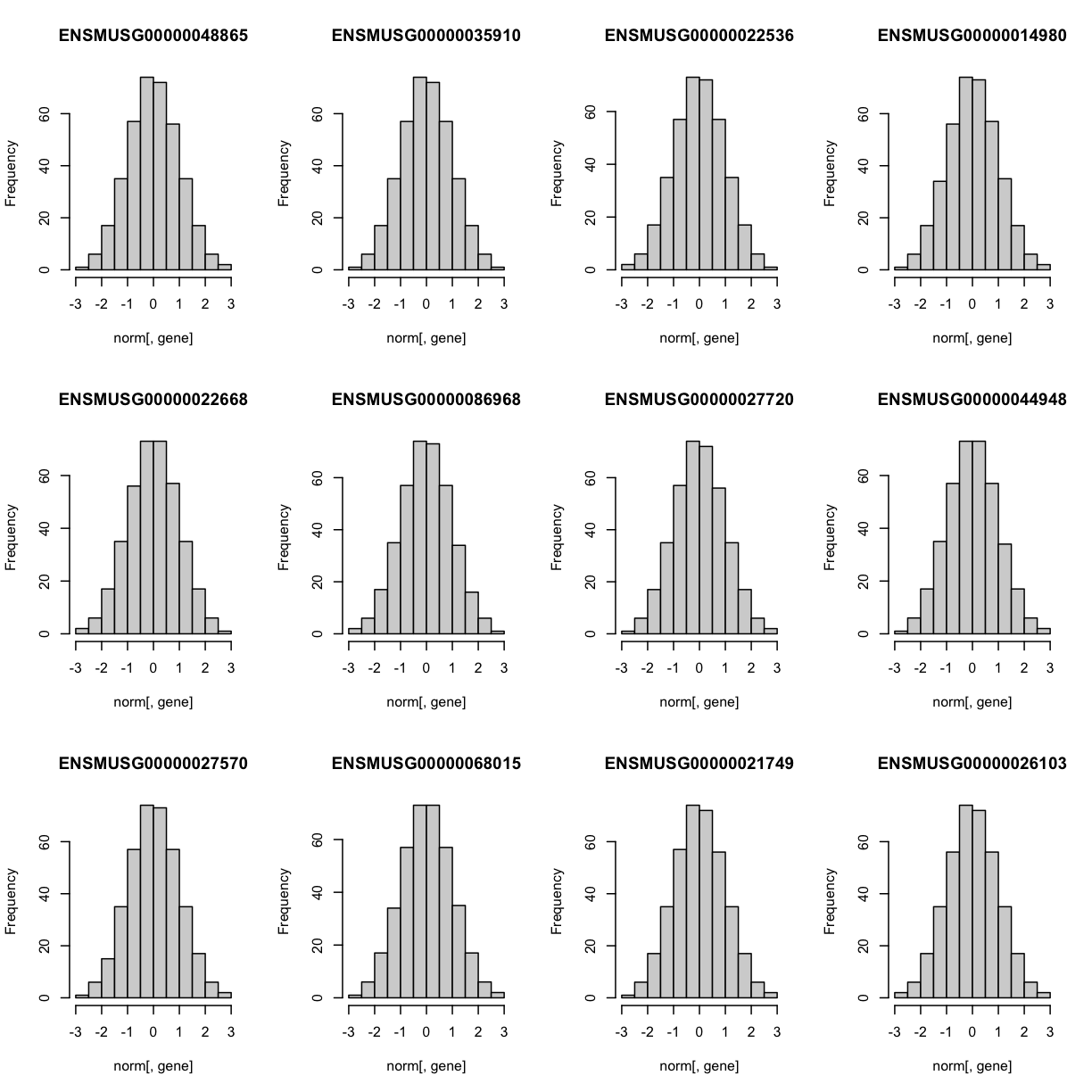
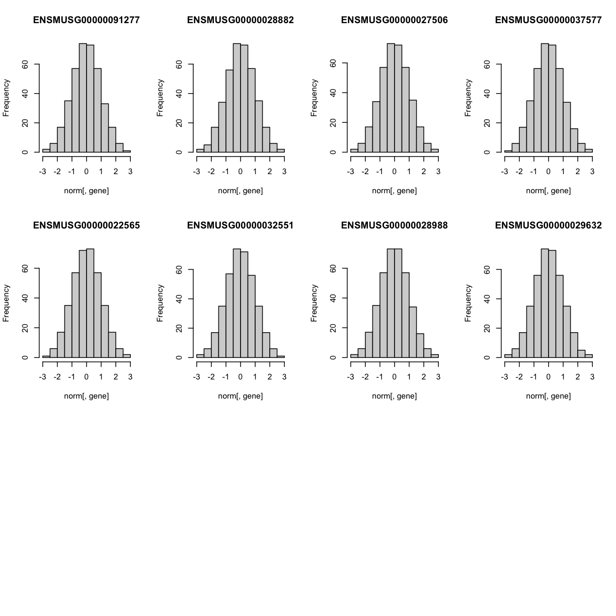 The histogram indicates that distribution of these counts are normalised (as they should be).
The Marker Map
We are using the same marker map as in the previous lesson
Genotype probabilities
We have explored this earlier in th previous lesson. But, as a reminder, we have already calculated genotype probabilities which we loaded above called probs. This contains the 8 state genotype probabilities using the 69k grid map of the same 500 DO mice that also have clinical phenotypes.
Kinship Matrix
We have explored the kinship matrix in the previous lesson. It has already been calculated and loaded in above.
Covariates
Now let’s add the necessary covariates. For these 50 gene expression data, let’s see which covariates are significant.
###merging covariate data and expression data to test for sex, wave and diet_days.

cov.counts <- merge(covar, norm[,genes], by=c("row.names"), sort=F)

#testing covairates on expression data

tmp = cov.counts %>%
        dplyr::select(mouse, sex, DOwave, diet_days, names(cov.counts[,genes])) %>%
        gather(expression, value, -mouse, -sex, -DOwave, -diet_days) %>%
        group_by(expression) %>%
        nest()
mod_fxn = function(df) {
  lm(value ~ sex + DOwave + diet_days, data = df)
}
tmp = tmp %>%
  mutate(model = map(data, mod_fxn)) %>%
  mutate(summ = map(model, tidy)) %>%
  unnest(summ)
#  kable(tmp, caption = "Effects of Sex, Wave & Diet Days on Expression")

tmp
# A tibble: 200 × 8
# Groups: expression [50]
expression data model term estimate std.e…¹ stati…² p.value
<chr> <list> <list> <chr> <dbl> <dbl> <dbl> <dbl>
1 ENSMUSG00000048865 <tibble> <lm> (Interce… 0.628 0.620 1.01 0.311
2 ENSMUSG00000048865 <tibble> <lm> sexM -0.178 0.101 -1.76 0.0791
3 ENSMUSG00000048865 <tibble> <lm> DOwave -0.0464 0.0454 -1.02 0.308
4 ENSMUSG00000048865 <tibble> <lm> diet_days -0.00327 0.00474 -0.690 0.491
5 ENSMUSG00000035910 <tibble> <lm> (Interce… 0.227 0.616 0.369 0.713
6 ENSMUSG00000035910 <tibble> <lm> sexM 0.167 0.100 1.66 0.0972
7 ENSMUSG00000035910 <tibble> <lm> DOwave -0.0359 0.0451 -0.795 0.427
8 ENSMUSG00000035910 <tibble> <lm> diet_days -0.00172 0.00470 -0.365 0.715
9 ENSMUSG00000022536 <tibble> <lm> (Interce… -0.188 0.512 -0.368 0.713
10 ENSMUSG00000022536 <tibble> <lm> sexM -0.0204 0.0834 -0.245 0.806
# … with 190 more rows, and abbreviated variable names ¹std.error, ²statistic
tmp %>%
  filter(term != "(Intercept)") %>%
  mutate(neg.log.p = -log10(p.value)) %>%
  ggplot(aes(term, neg.log.p)) +
    geom_point() +
    facet_wrap(~expression, ncol=10) +
    labs(title = "Significance of Sex, Wave & Diet Days on Expression") +
    theme(axis.text.x = element_text(angle = 90, hjust = 1, vjust = 0.5)) +
rm(tmp)
We can see that DOwave is the most significant. However, given that a few are influenced by sex and diet_days, we will have to correct for those as well.
# convert sex and DO wave (batch) to factors
pheno_clin$sex = factor(pheno_clin$sex)
pheno_clin$DOwave = factor(pheno_clin$DOwave)
pheno_clin$diet_days = factor(pheno_clin$DOwave)

covar = model.matrix(~sex + DOwave + diet_days, data = pheno_clin)
Performing a genome scan
Now lets perform the genome scan! We are also going to save our qtl results in an Rdata file to be used in further lessons.
QTL Scans
qtl.file = "../results/gene.norm_qtl_cis.trans.Rdata"

if(file.exists(qtl.file)) {
  load(qtl.file)
  } else {
    qtl = scan1(genoprobs = probs,
                pheno = norm[,genes, drop = FALSE],
                kinship = K,
                addcovar = covar,
                cores = 2)
    save(qtl, file = qtl.file)
    }
QTL plots
Let’s plot the first 20 gene expression phenotypes. If you would like to plot all 50, change for(i in 1:20) in the code below to for(i in 1:ncol(qtl)).
par(mfrow=c(3,4))
for(i in 1:20) {
  plot_scan1(x = qtl,
             map = map,
             lodcolumn = i,
             main = colnames(qtl)[i])
  abline(h = 6, col = 2, lwd = 2)
  }
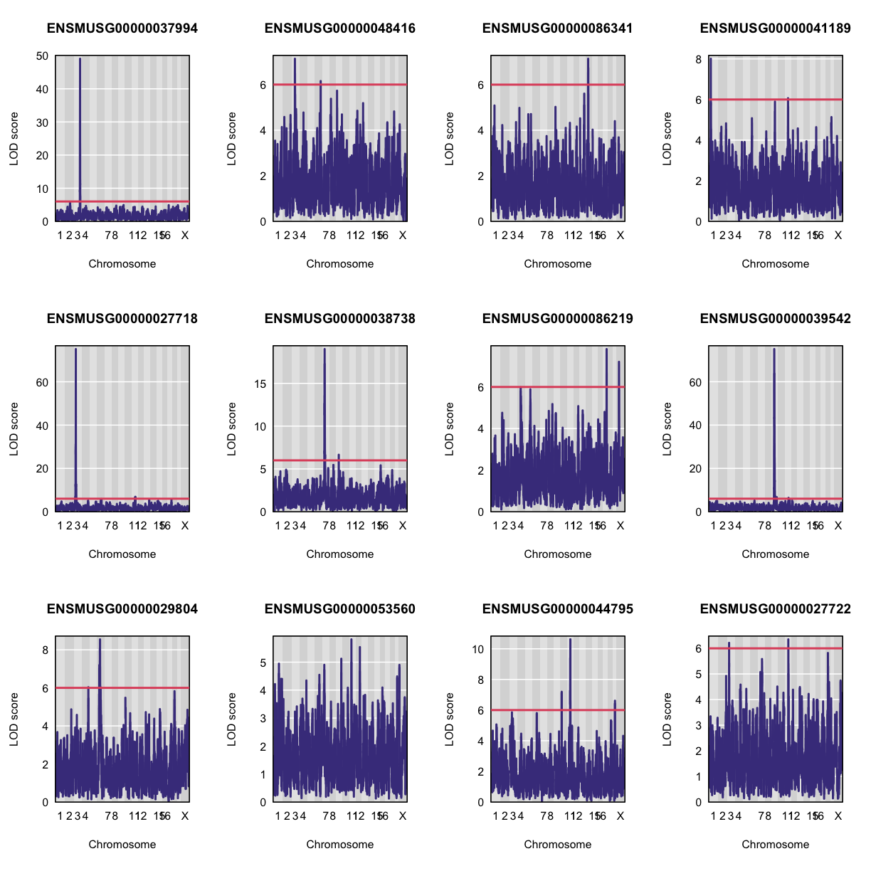
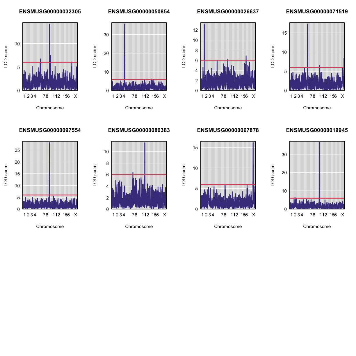
QTL Peaks
We are also going to save our peak results so we can use these again else where. First, lets get out peaks with a LOD score greater than 6.
lod_threshold = 6
peaks = find_peaks(scan1_output = qtl,
                   map = map,
                   threshold = lod_threshold,
                   peakdrop = 4,
                   prob = 0.95)
We will save these peaks into a csv file.
kable(peaks %>%
        dplyr::select(-lodindex) %>%
        arrange(chr, pos), caption = "Expression QTL (eQTL) Peaks with LOD >= 6")

write_csv(peaks, "../results/gene.norm_qtl_peaks_cis.trans.csv")
Table: Phenotype QTL Peaks with LOD >= 6
| lodcolumn | chr | pos | lod | ci_lo | ci_hi |
|---|---|---|---|---|---|
| ENSMUSG00000033389 | 1 | 24.116007 | 6.296328 | 18.001823 | 32.48454 |
| ENSMUSG00000041189 | 1 | 38.681019 | 8.009293 | 37.690607 | 38.99625 |
| ENSMUSG00000015112 | 1 | 74.157715 | 6.390019 | 73.792993 | 190.01604 |
| ENSMUSG00000058420 | 1 | 190.002808 | 6.531293 | 135.481336 | 191.89737 |
| ENSMUSG00000026637 | 1 | 192.137668 | 13.183821 | 191.655992 | 192.51205 |
| ENSMUSG00000019945 | 2 | 72.077418 | 6.609965 | 17.713445 | 169.28966 |
| ENSMUSG00000081046 | 2 | 129.184651 | 6.497957 | 12.915206 | 135.45041 |
| ENSMUSG00000097283 | 2 | 153.419672 | 8.793228 | 150.991127 | 153.83765 |
| ENSMUSG00000027487 | 2 | 156.136279 | 6.608979 | 154.085478 | 156.75363 |
| ENSMUSG00000027487 | 2 | 161.576254 | 7.091103 | 161.309135 | 162.89119 |
| ENSMUSG00000054455 | 2 | 165.445995 | 8.888555 | 163.582672 | 166.47560 |
| ENSMUSG00000097283 | 2 | 178.833418 | 30.515193 | 176.416737 | 178.90319 |
| ENSMUSG00000027718 | 3 | 33.606276 | 31.217791 | 32.304940 | 33.65661 |
| ENSMUSG00000027718 | 3 | 37.165286 | 75.126515 | 36.852209 | 37.32921 |
| ENSMUSG00000027722 | 3 | 37.374870 | 6.214390 | 34.262328 | 114.46680 |
| ENSMUSG00000048416 | 3 | 67.791179 | 7.134414 | 66.785770 | 73.56933 |
| ENSMUSG00000000340 | 3 | 114.948141 | 9.484962 | 111.607392 | 114.97076 |
| ENSMUSG00000037994 | 3 | 135.232817 | 49.079161 | 135.232817 | 135.23282 |
| ENSMUSG00000021127 | 4 | 3.798433 | 6.132635 | 3.000000 | 149.94046 |
| ENSMUSG00000070980 | 4 | 54.766817 | 11.218926 | 54.527023 | 55.60324 |
| ENSMUSG00000096177 | 4 | 65.427487 | 8.792047 | 63.528309 | 78.76958 |
| ENSMUSG00000033389 | 4 | 111.238045 | 6.214717 | 109.522381 | 116.12848 |
| ENSMUSG00000050854 | 4 | 118.471245 | 35.618326 | 118.397472 | 118.54342 |
| ENSMUSG00000029804 | 4 | 143.211132 | 6.035045 | 138.750051 | 148.34659 |
| ENSMUSG00000029321 | 4 | 154.874097 | 6.069940 | 20.129417 | 156.21626 |
| ENSMUSG00000081046 | 5 | 98.997378 | 6.773936 | 92.854978 | 103.17849 |
| ENSMUSG00000029321 | 5 | 103.614608 | 21.562401 | 103.586587 | 105.67241 |
| ENSMUSG00000099095 | 5 | 108.046168 | 6.777903 | 102.956536 | 112.75631 |
| ENSMUSG00000032305 | 6 | 37.349577 | 6.720697 | 16.376879 | 48.92068 |
| ENSMUSG00000071519 | 6 | 41.406513 | 17.315115 | 40.920539 | 41.40651 |
| ENSMUSG00000002797 | 6 | 54.997148 | 39.222855 | 54.855033 | 55.18362 |
| ENSMUSG00000029804 | 6 | 58.488862 | 8.546978 | 40.993625 | 60.76170 |
| ENSMUSG00000089634 | 6 | 86.133168 | 11.672479 | 85.420854 | 86.55060 |
| ENSMUSG00000048416 | 6 | 125.226964 | 6.154786 | 45.277826 | 125.94593 |
| ENSMUSG00000031532 | 6 | 125.553788 | 6.312708 | 63.210018 | 126.65001 |
| ENSMUSG00000070980 | 6 | 127.078807 | 6.130341 | 126.722486 | 135.05159 |
| ENSMUSG00000080968 | 6 | 133.867522 | 6.004287 | 129.390996 | 139.21454 |
| ENSMUSG00000015112 | 6 | 134.185817 | 6.123813 | 129.110159 | 135.65721 |
| ENSMUSG00000070980 | 6 | 145.839910 | 6.202777 | 145.391545 | 146.31853 |
| ENSMUSG00000025557 | 7 | 36.613646 | 6.506206 | 35.767556 | 133.15669 |
| ENSMUSG00000038738 | 7 | 44.445619 | 19.010804 | 43.844466 | 44.86733 |
| ENSMUSG00000080383 | 7 | 57.912994 | 6.407887 | 50.696529 | 101.62734 |
| ENSMUSG00000058420 | 7 | 118.237771 | 29.916509 | 117.782005 | 118.45922 |
| ENSMUSG00000021676 | 8 | 22.086620 | 6.149473 | 18.457359 | 115.32557 |
| ENSMUSG00000031532 | 8 | 33.827024 | 17.787609 | 33.095603 | 34.20777 |
| ENSMUSG00000002797 | 8 | 95.702894 | 6.560175 | 94.937120 | 103.87985 |
| ENSMUSG00000049307 | 9 | 14.764262 | 117.447471 | 14.703558 | 14.84658 |
| ENSMUSG00000054455 | 9 | 27.198455 | 7.336424 | 20.908490 | 110.55064 |
| ENSMUSG00000097554 | 9 | 41.186050 | 28.140130 | 40.780764 | 41.20384 |
| ENSMUSG00000039542 | 9 | 49.615275 | 75.098477 | 49.494008 | 50.10869 |
| ENSMUSG00000038738 | 9 | 50.108691 | 6.657000 | 49.051211 | 78.22393 |
| ENSMUSG00000038086 | 9 | 51.898259 | 9.842327 | 51.472947 | 52.50449 |
| ENSMUSG00000032305 | 9 | 57.362395 | 14.166389 | 57.359763 | 57.96257 |
| ENSMUSG00000039542 | 9 | 58.357965 | 24.965759 | 58.264792 | 58.51857 |
| ENSMUSG00000026637 | 9 | 66.202095 | 6.128876 | 61.127900 | 118.85930 |
| ENSMUSG00000039542 | 9 | 107.647626 | 6.709880 | 103.046146 | 108.28455 |
| ENSMUSG00000032305 | 9 | 117.664006 | 7.429687 | 116.937976 | 118.80569 |
| ENSMUSG00000044795 | 10 | 22.909158 | 7.195228 | 21.125750 | 23.14018 |
| ENSMUSG00000019945 | 10 | 68.436555 | 36.340070 | 68.296752 | 68.55129 |
| ENSMUSG00000019945 | 10 | 68.966184 | 32.570583 | 68.966184 | 69.22692 |
| ENSMUSG00000071519 | 10 | 75.574081 | 6.462753 | 73.705382 | 83.04843 |
| ENSMUSG00000029321 | 10 | 125.591103 | 7.538025 | 125.539735 | 126.86601 |
| ENSMUSG00000080968 | 11 | 16.903986 | 6.044069 | 9.065479 | 41.96490 |
| ENSMUSG00000069910 | 11 | 34.822220 | 26.757661 | 34.701511 | 34.82222 |
| ENSMUSG00000033389 | 11 | 65.063246 | 9.777574 | 64.648612 | 68.88967 |
| ENSMUSG00000041189 | 11 | 67.078257 | 6.065475 | 64.368932 | 70.61624 |
| ENSMUSG00000044795 | 11 | 68.892129 | 10.613848 | 65.096598 | 69.41636 |
| ENSMUSG00000027722 | 11 | 73.111862 | 6.349757 | 73.005652 | 77.67011 |
| ENSMUSG00000039542 | 11 | 78.151256 | 6.402459 | 5.561303 | 105.51410 |
| ENSMUSG00000027718 | 11 | 79.152432 | 6.886785 | 70.782062 | 82.07630 |
| ENSMUSG00000051452 | 11 | 84.107102 | 10.077904 | 83.647144 | 84.68618 |
| ENSMUSG00000025557 | 11 | 98.275118 | 6.140239 | 90.223909 | 99.34041 |
| ENSMUSG00000080383 | 11 | 109.423954 | 11.546496 | 109.406840 | 111.19709 |
| ENSMUSG00000027487 | 12 | 6.347016 | 6.708630 | 5.846368 | 11.34456 |
| ENSMUSG00000033373 | 12 | 76.788953 | 32.214804 | 76.548097 | 76.88841 |
| ENSMUSG00000021127 | 12 | 83.238468 | 6.982385 | 82.129546 | 86.61000 |
| ENSMUSG00000058420 | 12 | 84.148297 | 6.072393 | 80.160035 | 117.40074 |
| ENSMUSG00000021271 | 12 | 87.166517 | 6.136045 | 56.572766 | 88.46608 |
| ENSMUSG00000049307 | 12 | 107.833410 | 6.639038 | 106.974113 | 109.52447 |
| ENSMUSG00000021271 | 12 | 110.197950 | 33.653196 | 110.180714 | 111.45223 |
| ENSMUSG00000099095 | 13 | 15.611917 | 8.154411 | 13.283182 | 18.32901 |
| ENSMUSG00000015112 | 13 | 35.457506 | 6.362942 | 34.416849 | 105.15802 |
| ENSMUSG00000027487 | 13 | 64.344624 | 9.185658 | 63.548321 | 67.69218 |
| ENSMUSG00000097283 | 13 | 65.206454 | 10.783729 | 64.841763 | 66.93469 |
| ENSMUSG00000021676 | 13 | 95.733655 | 100.243082 | 95.733655 | 95.85903 |
| ENSMUSG00000069910 | 13 | 101.786348 | 6.927969 | 101.137104 | 102.83022 |
| ENSMUSG00000050854 | 14 | 31.435803 | 6.178650 | 28.932629 | 94.70510 |
| ENSMUSG00000086341 | 14 | 48.126291 | 7.138599 | 46.678372 | 51.99293 |
| ENSMUSG00000025557 | 14 | 99.566266 | 6.659106 | 13.014489 | 101.18782 |
| ENSMUSG00000025557 | 14 | 121.571691 | 35.458616 | 121.480418 | 121.67373 |
| ENSMUSG00000022292 | 15 | 38.227976 | 7.784003 | 36.256559 | 41.45437 |
| ENSMUSG00000015112 | 15 | 58.990004 | 7.527785 | 58.658042 | 60.07672 |
| ENSMUSG00000060487 | 15 | 60.990009 | 6.909902 | 58.857152 | 67.06317 |
| ENSMUSG00000022292 | 15 | 64.643518 | 6.404510 | 62.181647 | 72.90648 |
| ENSMUSG00000024085 | 15 | 66.679768 | 7.227881 | 63.659243 | 68.92043 |
| ENSMUSG00000080968 | 15 | 100.424363 | 59.731554 | 99.800294 | 100.43483 |
| ENSMUSG00000026637 | 16 | 94.789233 | 6.874482 | 3.000000 | 94.97204 |
| ENSMUSG00000015112 | 17 | 43.242630 | 7.536525 | 34.179599 | 43.56276 |
| ENSMUSG00000024085 | 17 | 64.655048 | 55.404509 | 64.600441 | 64.72895 |
| ENSMUSG00000069910 | 17 | 69.244748 | 6.998414 | 68.506902 | 70.46603 |
| ENSMUSG00000086219 | 17 | 78.830855 | 7.823507 | 77.910515 | 80.14648 |
| ENSMUSG00000070980 | 17 | 89.875434 | 6.190791 | 78.362313 | 94.98443 |
| ENSMUSG00000032305 | 18 | 68.177134 | 6.075548 | 65.041330 | 68.20743 |
| ENSMUSG00000002797 | 19 | 38.421678 | 6.062762 | 36.662639 | 40.14056 |
| ENSMUSG00000044795 | 19 | 40.204814 | 6.610261 | 38.774165 | 40.22262 |
| ENSMUSG00000021676 | X | 12.322085 | 7.621003 | 11.895188 | 12.99006 |
| ENSMUSG00000086219 | X | 49.017962 | 7.209342 | 48.174569 | 50.20412 |
| ENSMUSG00000009079 | X | 53.140129 | 7.474459 | 51.892232 | 59.08406 |
| ENSMUSG00000067878 | X | 56.774258 | 16.144863 | 53.969865 | 56.80714 |
| ENSMUSG00000015112 | X | 150.513256 | 10.317359 | 145.335742 | 157.49709 |
| ENSMUSG00000058420 | X | 153.682008 | 7.479411 | 146.728544 | 163.71076 |
| ENSMUSG00000022292 | X | 158.566592 | 6.854800 | 155.383862 | 160.34933 |
| ENSMUSG00000071519 | X | 166.335626 | 8.361242 | 164.415283 | 167.22935 |
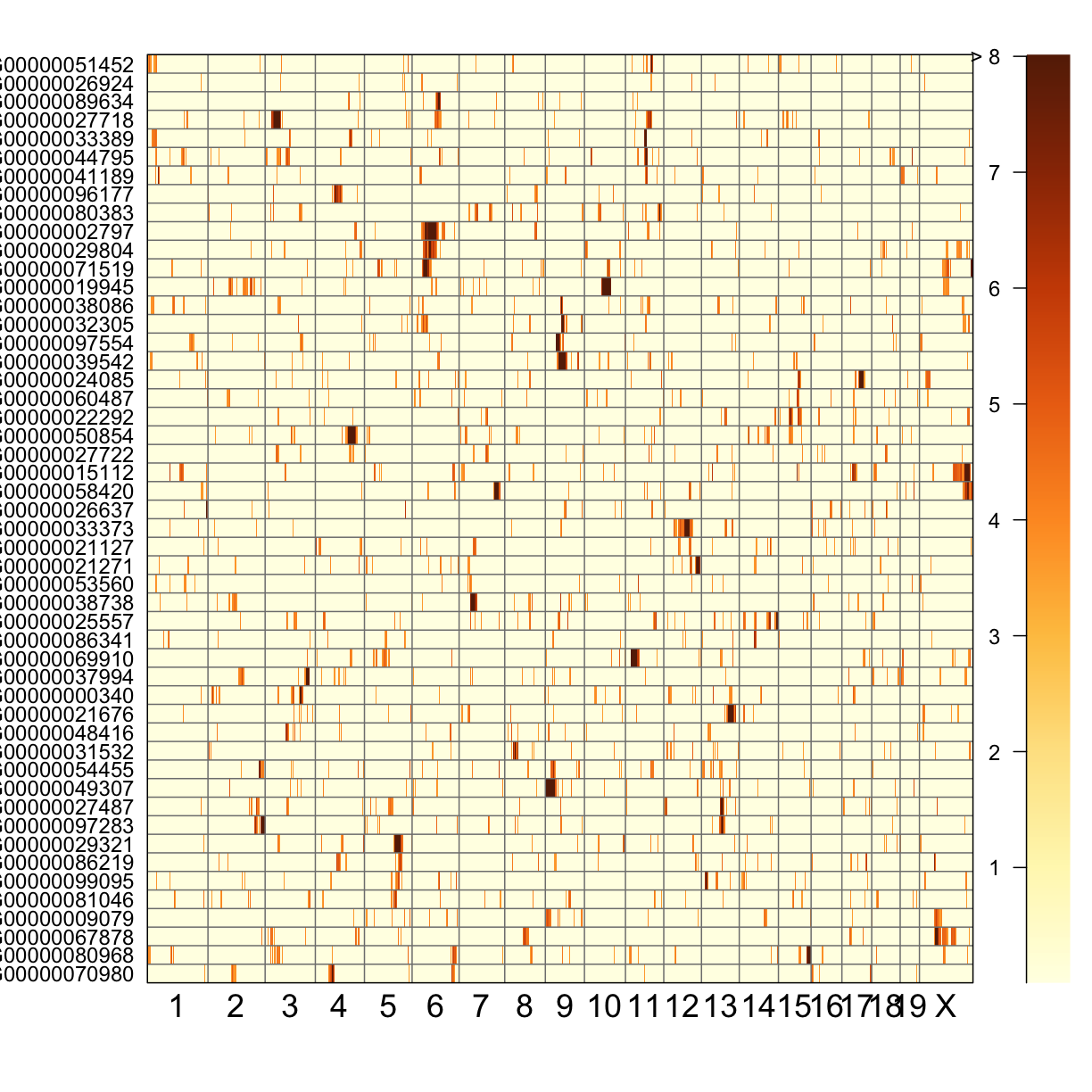
QTL Peaks Figure
qtl_heatmap(qtl = qtl, map = map, low.thr = 3.5)
Challenge
What do the qtl scans for all gene exression traits look like? Note: Don’t worry, we’ve done the qtl scans for you!!! You can read in this file,
../data/gene.norm_qtl_all.genes.Rdata, which are thescan1results for all gene expression traits.Solution
load("../data/gene.norm_qtl_all.genes.Rdata")

lod_threshold = 6
peaks = find_peaks(scan1_output = qtl,
               map = map,
               threshold = lod_threshold,
               peakdrop = 4,
               prob = 0.95)
write_csv(peaks, "../results/gene.norm_qtl_all.genes_peaks.csv")

## Heat Map
qtl_heatmap(qtl = qtl, map = map, low.thr = 3.5)
Key Points
Creating A Transcriptome Map
Overview
Teaching: 30 min
Exercises: 30 minQuestions
How do I create and interpret a transcriptome map?
Objectives
Describe a transcriptome map.
Interpret a transcriptome map.
Load Libraries
library(tidyverse)
library(qtl2)
library(qtl2convert)
library(GGally)
library(broom)
library(corrplot)
library(RColorBrewer)
library(qtl2ggplot)

source("../code/gg_transcriptome_map.R")
source("../code/qtl_heatmap.R")
Load Data
#expression data
load("../data/attie_DO500_expr.datasets.RData")

##mapping data
load("../data/attie_DO500_mapping.data.RData")

##genoprobs
probs = readRDS("../data/attie_DO500_genoprobs_v5.rds")

##phenotypes
load("../data/attie_DO500_clinical.phenotypes.RData")

expr.mrna <- norm
In this lesson we are going to learn how to create a transcriptome map. At transcriptome map shows the location of the eQTL peak compared its gene location, giving information about cos and trans eQTLs.
We are going to use the file that we created in the previous lesson with the lod scores greater than 6: gene.norm_qtl_peaks_cis.trans.csv.
You can load it in using the following code:
lod_summary = read.csv("../results/gene.norm_qtl_peaks_cis.trans.csv")
lod_summary$marker.id <- paste0(lod_summary$chr,
                                "_",
                                lod_summary$pos * 1000000)
ensembl = get_ensembl_genes()
snapshotDate(): 2022-04-25
loading from cache
Importing File into R ..
id    = ensembl$gene_id
chr   = seqnames(ensembl)
start = start(ensembl) * 1e-6
end   = end(ensembl)   * 1e-6
df = data.frame(ensembl = id,
                gene_chr = chr,
                gene_start = start,
                gene_end = end,
                stringsAsFactors = F)
colnames(lod_summary)[colnames(lod_summary) == "lodcolumn"] = "ensembl"
colnames(lod_summary)[colnames(lod_summary) == "chr"] = "qtl_chr"
colnames(lod_summary)[colnames(lod_summary) == "pos"] = "qtl_pos"
colnames(lod_summary)[colnames(lod_summary) == "lod"] = "qtl_lod"
lod_summary = left_join(lod_summary, df, by = "ensembl")
lod_summary = mutate(lod_summary,
                     gene_chr = factor(gene_chr, levels = c(1:19, "X")),
                     qtl_chr = factor(qtl_chr, levels = c(1:19, "X")))
rm(df)
We can summarise which eQTLs are cis or trans. Remember a cis qtl is… and trans eqtl is….
lod_summary$cis.trans <- ifelse(lod_summary$qtl_chr == lod_summary$gene_chr, "cis", "trans")
table(lod_summary$cis.trans)
  cis trans
   47    65
Plot Transcriptome Map
lod_summary = mutate(lod_summary, cis = (gene_chr == qtl_chr) & (abs(gene_start - qtl_pos) < 4))
out.plot = ggtmap(data = lod_summary %>% filter(qtl_lod >= 7.18), cis.points = TRUE, cis.radius = 4)
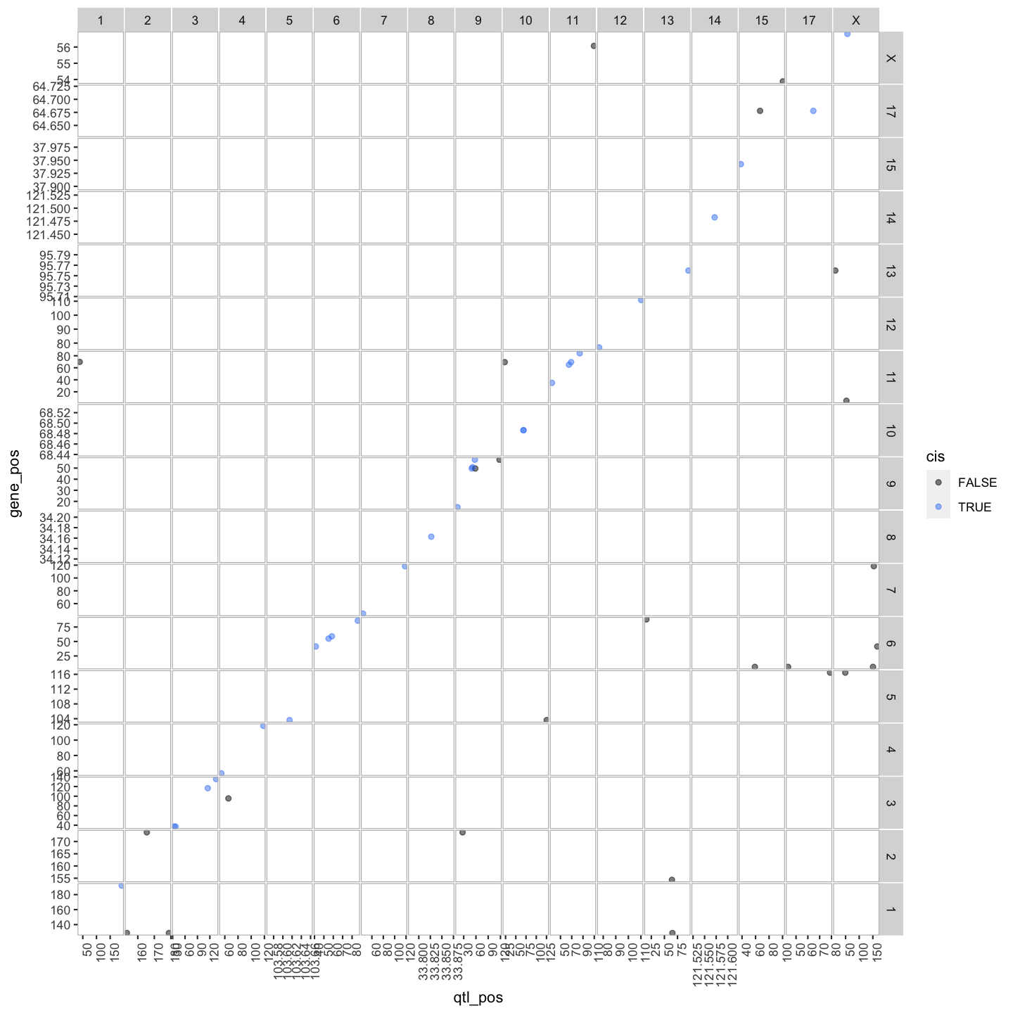
pdf("../results/transcriptome_map_cis.trans.pdf", width = 10, height = 10)
out.plot
dev.off()
quartz_off_screen
                2
out.plot

Key Points
Transcriptome maps aid in understanding gene expression regulation.
Transcriptome Map of cis and trans eQTL
Overview
Teaching: 10 min
Exercises: 20 minQuestions
How do I create a full transcriptome map?
Objectives
Load Libraries
library(tidyverse)
library(qtl2)
library(qtl2convert)
#library(qtl2db)
library(GGally)
library(broom)
library(knitr)
library(corrplot)
library(RColorBrewer)
library(qtl2ggplot)

source("../code/gg_transcriptome_map.R")
source("../code/qtl_heatmap.R")
Load Data
#expression data
load("../data/attie_DO500_expr.datasets.RData")

##loading previous results
load("../data/dataset.islet.rnaseq.RData")

##mapping data
load("../data/attie_DO500_mapping.data.RData")

##genoprobs
probs = readRDS("../data/attie_DO500_genoprobs_v5.rds")

##phenotypes
load("../data/attie_DO500_clinical.phenotypes.RData")
lod_summary = dataset.islet.rnaseq$lod.peaks

ensembl = get_ensembl_genes()
id    = ensembl$gene_id
chr   = seqnames(ensembl)
start = start(ensembl) * 1e-6
end   = end(ensembl)   * 1e-6
df = data.frame(ensembl = id, gene_chr = chr, gene_start = start, gene_end = end,
     stringsAsFactors = F)
colnames(lod_summary)[colnames(lod_summary) == "annot.id"] = "ensembl"
colnames(lod_summary)[colnames(lod_summary) == "chrom"] = "qtl_chr"
colnames(lod_summary)[colnames(lod_summary) == "pos"] = "qtl_pos"
colnames(lod_summary)[colnames(lod_summary) == "lod"] = "qtl_lod"
lod_summary = left_join(lod_summary, df, by = "ensembl")
lod_summary = mutate(lod_summary, gene_chr = factor(gene_chr, levels = c(1:19, "X")),
                     qtl_chr = factor(qtl_chr, levels = c(1:19, "X")))
rm(df)

## summary:

lod_summary$cis.trans <- ifelse(lod_summary$qtl_chr == lod_summary$gene_chr, "cis", "trans")
table(lod_summary$cis.trans)
  cis trans
14549 24299
Plot Transcriptome Map
lod_summary = mutate(lod_summary, cis = (gene_chr == qtl_chr) & (abs(gene_start - qtl_pos) < 4))
out.plot = ggtmap(data = lod_summary %>% filter(qtl_lod >= 7.18), cis.points = TRUE, cis.radius = 4)
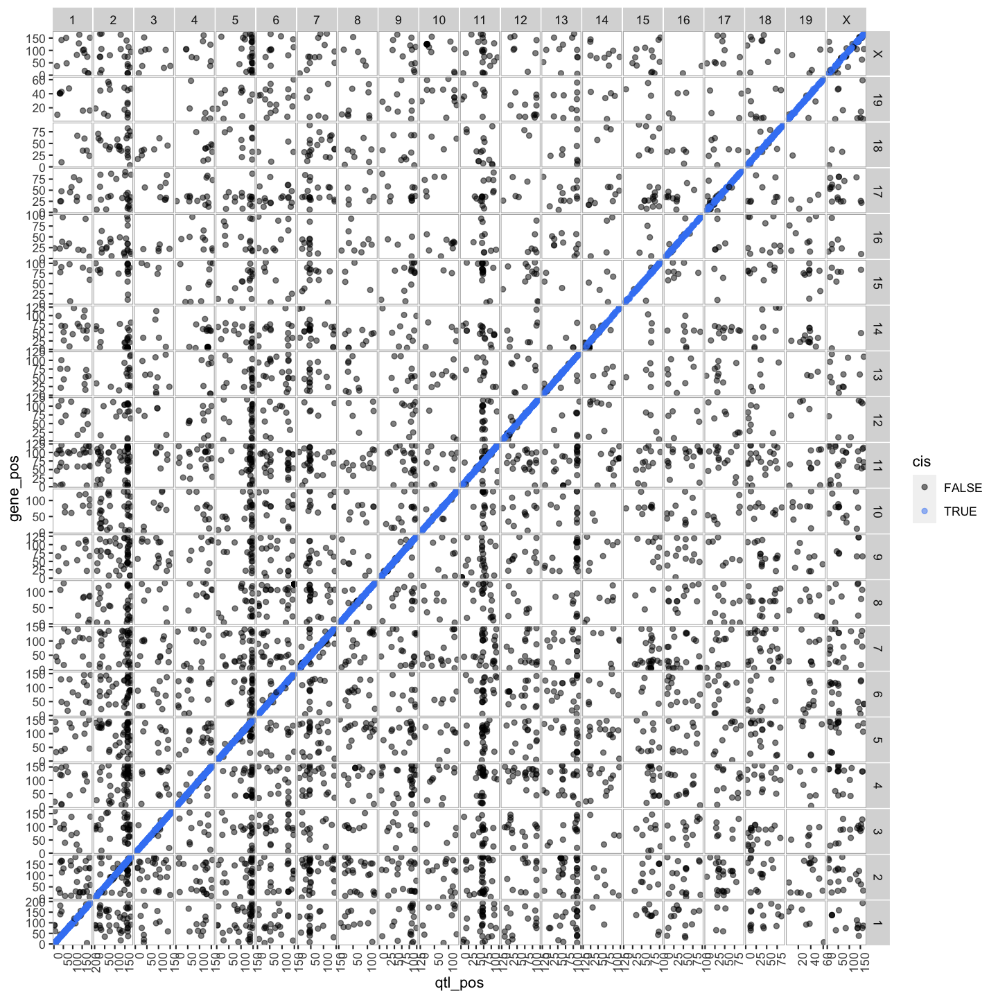
out.plot

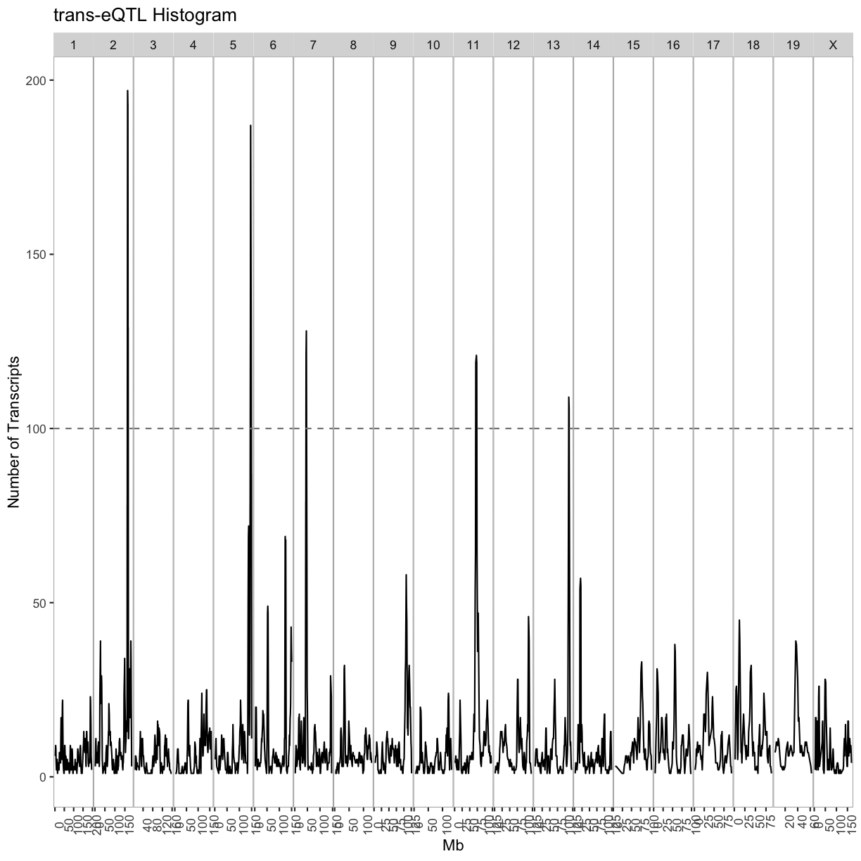
QTL Density Plot
breaks = matrix(c(seq(0, 200, 4), seq(1, 201, 4), seq(2, 202, 4), seq(3, 203, 4)), ncol = 4)
tmp = as.list(1:ncol(breaks))
for(i in 1:ncol(breaks)) {
tmp[[i]] = lod_summary %>%
             filter(qtl_lod >= 7.18 & cis == FALSE) %>%
             arrange(qtl_chr, qtl_pos) %>%
             group_by(qtl_chr) %>%
             mutate(win = cut(qtl_pos, breaks = breaks[,i])) %>%
             group_by(qtl_chr, win) %>%
             summarize(cnt = n()) %>%
             separate(win, into = c("other", "prox", "dist")) %>%
             mutate(prox = as.numeric(prox),
                    dist = as.numeric(dist),
                    mid = 0.5 * (prox + dist)) %>%
             dplyr::select(qtl_chr, mid, cnt)
}

trans = bind_rows(tmp[[1]], tmp[[1]], tmp[[3]], tmp[[4]])
rm(tmp)

out.plot = ggplot(trans, aes(mid, cnt)) +
             geom_line() +
             geom_hline(aes(yintercept = 100), linetype = 2, color = "grey50") +
             facet_grid(.~qtl_chr, scales = "free") +
             theme(panel.background = element_blank(),
             panel.border = element_rect(fill = 0, color = "grey70"),
             panel.spacing = unit(0, "lines"),
             axis.text.x = element_text(angle = 90)) +
             labs(title = "trans-eQTL Histogram", x = "Mb", y = "Number of Transcripts")

out.plot
breaks = matrix(c(seq(0, 200, 4), seq(1, 201, 4), seq(2, 202, 4), seq(3, 203, 4)), ncol = 4)
tmp = as.list(1:ncol(breaks))
for(i in 1:ncol(breaks)) {
tmp[[i]] = lod_summary %>%
             filter(qtl_lod >= 7.18 & cis == TRUE) %>%
             arrange(qtl_chr, qtl_pos) %>%
             group_by(qtl_chr) %>%
             mutate(win = cut(qtl_pos, breaks = breaks[,i])) %>%
             group_by(qtl_chr, win) %>%
             summarize(cnt = n()) %>%
             separate(win, into = c("other", "prox", "dist")) %>%
             mutate(prox = as.numeric(prox),
                    dist = as.numeric(dist),
                    mid = 0.5 * (prox + dist)) %>%
             dplyr::select(qtl_chr, mid, cnt)
}

cis = bind_rows(tmp[[1]], tmp[[2]], tmp[[3]], tmp[[4]])
rm(tmp1, tmp2, tmp3, tmp4)

out.plot = ggplot(cis, aes(mid, cnt)) +
             geom_line(color = "#4286f4") +
             geom_hline(aes(yintercept = 100), linetype = 2, color = "grey50") +
             facet_grid(.~qtl_chr, scales = "free") +
             theme(panel.background = element_blank(),
                   panel.border = element_rect(fill = 0, color = "grey70"),
                   panel.spacing = unit(0, "lines"),
                   axis.text.x = element_text(angle = 90)) +
           labs(title = "cis-eQTL Histogram", x = "Mb", y = "Number of Transcripts")

out.plot
tmp = lod_summary %>%
        filter(qtl_lod >= 7.18) %>%
        group_by(cis) %>%
        count()
kable(tmp, caption = "Number of cis- and trans-eQTL")
Table: Number of cis- and trans-eQTL
| cis | n |
|---|---|
| FALSE | 5617 |
| TRUE | 12677 |
| NA | 526 |
rm(tmp)
Islet RNASeq eQTL Hotspots
Select eQTL Hotspots
Select trans-eQTL hotspots with more than 100 genes at the 7.18 LOD thresholds. Retain the maximum per chromosome.
hotspots = trans %>%
             group_by(qtl_chr) %>%
             filter(cnt >= 100) %>%
             summarize(center = median(mid)) %>%
             mutate(proximal = center - 2, distal = center + 2)
kable(hotspots, caption = "Islet trans-eQTL hotspots")
Table: Islet trans-eQTL hotspots
| qtl_chr | center | proximal | distal |
|---|---|---|---|
| 2 | 165.5 | 163.5 | 167.5 |
| 5 | 146.0 | 144.0 | 148.0 |
| 7 | 46.0 | 44.0 | 48.0 |
| 11 | 71.0 | 69.0 | 73.0 |
| 13 | 112.5 | 110.5 | 114.5 |
cis.hotspots = cis %>%
             group_by(qtl_chr) %>%
             filter(cnt >= 100) %>%
             summarize(center = median(mid)) %>%
             mutate(proximal = center - 2, distal = center + 2)
kable(cis.hotspots, caption = "Islet cis-eQTL hotspots")
Table: Islet cis-eQTL hotspots
| qtl_chr | center | proximal | distal |
|---|---|---|---|
| 7 | 29.0 | 27.0 | 31.0 |
| 17 | 34.5 | 32.5 | 36.5 |
Given the hotspot locations, retain all genes with LOD > 7.18 and trans-eQTL within +/- 4Mb of the mid-point of the hotspot.
hotspot.genes = as.list(hotspots$qtl_chr)
names(hotspot.genes) = hotspots$qtl_chr
for(i in 1:nrow(hotspots)) {
  hotspot.genes[[i]] = lod_summary %>%
                         filter(qtl_lod >= 7.18) %>%
                         filter(qtl_chr == hotspots$qtl_chr[i] &
                           qtl_pos >= hotspots$proximal[i] &
                           qtl_pos <= hotspots$distal[i] &
                           (gene_chr != hotspots$qtl_chr[i] |
                           (gene_chr == hotspots$qtl_chr[i] &
                            gene_start > hotspots$distal[i] + 1 &
                            gene_end < hotspots$proximal[i] - 1)))
  write_csv(hotspot.genes[[i]], file = paste0("../results/chr", names(hotspot.genes)[i], "_hotspot_genes.csv"))
}
Number of genes in each hotspot.
hotspots = data.frame(hotspots, count = sapply(hotspot.genes, nrow))
kable(hotspots, caption = "Number of genes per hotspot")
Table: Number of genes per hotspot
| qtl_chr | center | proximal | distal | count | |
|---|---|---|---|---|---|
| 2 | 2 | 165.5 | 163.5 | 167.5 | 147 |
| 5 | 5 | 146.0 | 144.0 | 148.0 | 182 |
| 7 | 7 | 46.0 | 44.0 | 48.0 | 123 |
| 11 | 11 | 71.0 | 69.0 | 73.0 | 126 |
| 13 | 13 | 112.5 | 110.5 | 114.5 | 104 |
cis.hotspot.genes = as.list(cis.hotspots$qtl_chr)
names(cis.hotspot.genes) = cis.hotspots$qtl_chr
for(i in 1:nrow(cis.hotspots)) {
  cis.hotspot.genes[[i]] = lod_summary %>%
                             dplyr::select(ensembl, marker.id, qtl_chr, qtl_pos, qtl_lod) %>%
                             filter(qtl_lod >= 7.18) %>%
                             filter(qtl_chr == cis.hotspots$qtl_chr[i] &
                                    qtl_pos >= cis.hotspots$proximal[i] &
                                    qtl_pos <= cis.hotspots$distal[i])
  write_csv(cis.hotspot.genes[[i]], file = paste0("../results/chr", names(cis.hotspot.genes)[i], "_cis_hotspot_genes.csv"))
}
Number of genes in each cis-hotspot.
cis.hotspots = data.frame(cis.hotspots, count = sapply(cis.hotspot.genes, nrow))
kable(cis.hotspots, caption = "Number of genes per cis-hotspot")
Table: Number of genes per cis-hotspot
| qtl_chr | center | proximal | distal | count | |
|---|---|---|---|---|---|
| 7 | 7 | 29.0 | 27.0 | 31.0 | 120 |
| 17 | 17 | 34.5 | 32.5 | 36.5 | 188 |
Get the expression of genes that map to each hotspot.
for(i in 1:length(hotspot.genes)) {
  tmp = data.frame(ensembl = hotspot.genes[[i]]$ensembl, t(expr.mrna[,hotspot.genes[[i]]$ensembl]))
  hotspot.genes[[i]] = left_join(hotspot.genes[[i]], tmp, by = "ensembl")
  write_csv(hotspot.genes[[i]], file = paste0("../results/chr", names(hotspot.genes)[i], "_hotspot_genes.csv"))
}
Error in h(simpleError(msg, call)): error in evaluating the argument 'x' in selecting a method for function 't': object 'expr.mrna' not found
Hotspot Gene Correlation
breaks = -100:100/100
colors = colorRampPalette(rev(brewer.pal(11, "Spectral")))(length(breaks) - 1)
for(i in 1:length(hotspot.genes)) {
  chr = names(hotspot.genes)[i]
  tmp = hotspot.genes[[i]] %>%
    dplyr::select(starts_with("DO")) %>%
    t() %>%
    as.matrix() %>%
    cor()
  dimnames(tmp) = list(hotspot.genes[[i]]$ensembl, hotspot.genes[[i]]$ensembl)
  side.colors = cut(hotspot.genes[[i]]$qtl_lod, breaks = 100)
  side.colors = colorRampPalette(rev(brewer.pal(9, "YlOrRd")))(length(levels(side.colors)))[as.numeric(side.colors)]
  names(side.colors) = rownames(tmp)

  heatmap(tmp, symm = TRUE, scale = "none", main = paste("Chr", chr, "Gene Correlation"), breaks = breaks, col = colors, RowSideColors = side.colors, ColSideColors = side.colors)
}
Error in hclustfun(distfun(x)): NA/NaN/Inf in foreign function call (arg 10)
Hotspot Principal Components
hotspot.pcs = as.list(names(hotspot.genes))
names(hotspot.pcs) = names(hotspot.genes)
do.wave = pheno_clin[rownames(expr.mrna),"DOwave",drop=F]
Error in h(simpleError(msg, call)): error in evaluating the argument 'x' in selecting a method for function 'rownames': object 'expr.mrna' not found
wave.col = as.numeric(as.factor(do.wave[,1]))
Error in h(simpleError(msg, call)): error in evaluating the argument 'x' in selecting a method for function 'as.factor': object 'do.wave' not found
#hotspot.genes.rns <- list()
for(i in 1:length(hotspot.genes)) {
  tmp = hotspot.genes[[i]] %>%
          dplyr::select(starts_with("DO")) %>%
          as.matrix() %>%
          t() %>%
          prcomp()
  hotspot.pcs[[i]] = tmp$x
  #rownames(hotspot.pcs[[i]]) <- gsub("\\.x","", rownames(hotspot.pcs[[i]]))
  #rownames(hotspot.pcs[[i]]) <- gsub("\\.y","", rownames(hotspot.pcs[[i]]))
  tmp = gather(data.frame(mouse = rownames(hotspot.pcs[[i]]), hotspot.pcs[[i]]), pc, value, -mouse)
  tmp$mouse <- gsub("\\.x","", tmp$mouse)
  tmp$mouse <- gsub("\\.y","", tmp$mouse)
  tmp = left_join(tmp, pheno_clin %>% dplyr::select(mouse, sex, DOwave, diet_days), by = "mouse")
  print(tmp %>%
    filter(pc %in% paste0("PC", 1:4)) %>%
    mutate(DOwave = factor(DOwave)) %>%
    ggplot(aes(DOwave, value, fill = sex)) +
    geom_boxplot() +
    facet_grid(pc~.) +
    labs(title = paste("Chr", names(hotspot.genes)[i], "Hotspot")))
}
Error in svd(x, nu = 0, nv = k): a dimension is zero
Key Points
.
Maximum eQTL Peaks and Nearby Genes
Overview
Teaching: 20 min
Exercises: 10 minQuestions
How do I display maximum eQTL peaks and nearby genes?
Objectives
.
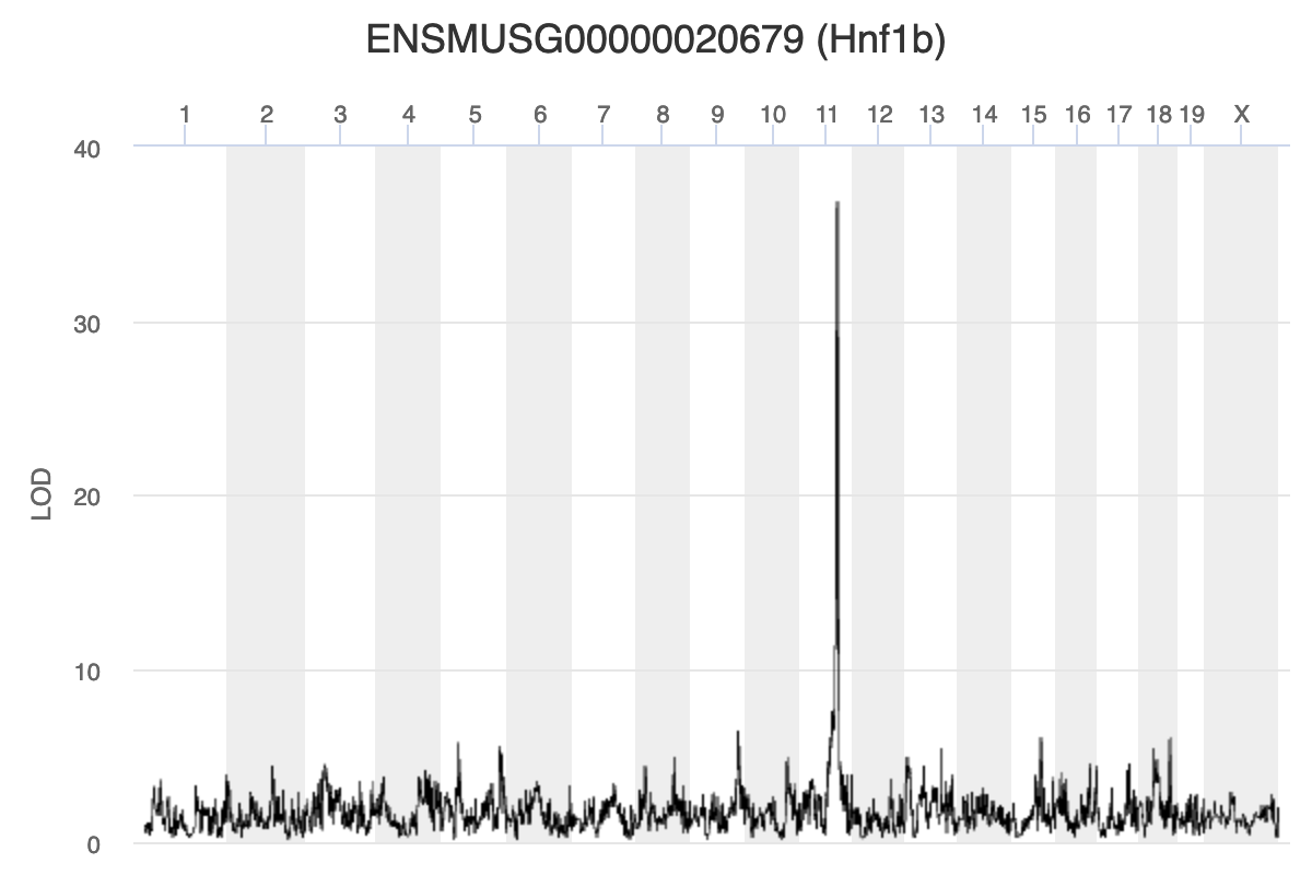
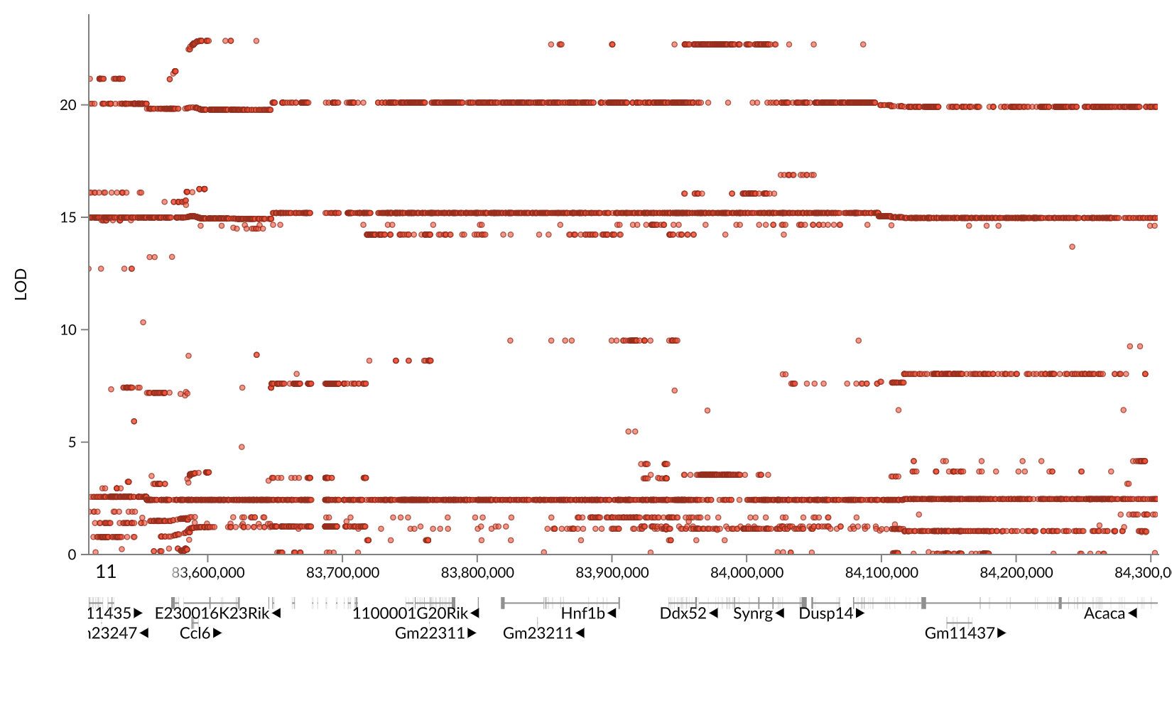
Key Points
.
Interpreting qtl2 results
Overview
Teaching: 10 min
Exercises: 2 minQuestions
How do I interpret qtl2 results?
Objectives
Interpret the relationship between sequence, expression and phenotype variation from qtl2 mapping results.
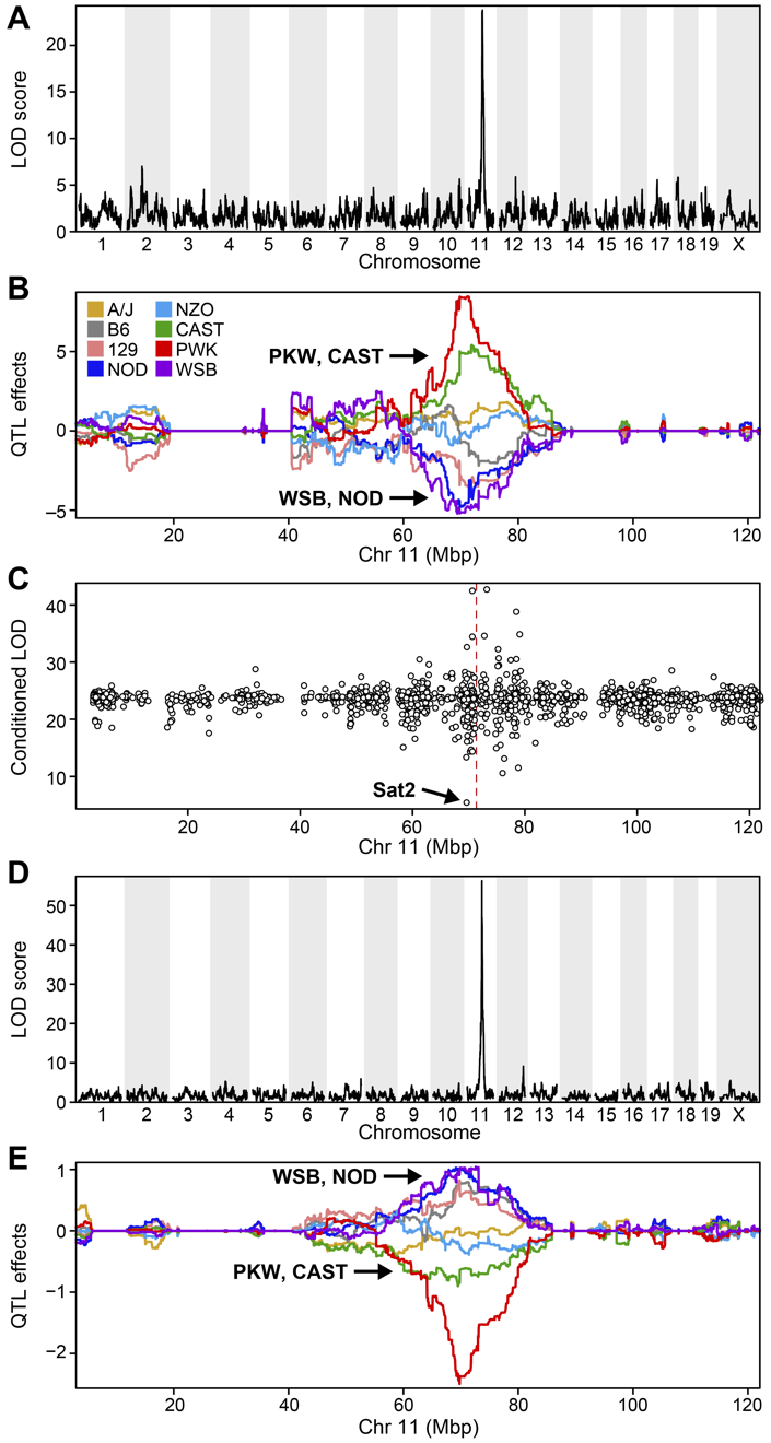
Challenge: Interpreting qtl2 results
Refer to the figure above.
1). What does panel A show? What conclusions could you draw from panel A?
2). What does panel B show? What conclusions could you draw from panel B?
3). What does panel C show? What conclusions could you draw from panel C?
4). How are panels A through C related to one another? What story do they tell together?Solution
Key Points
Edit the .Rmd files not the .md files
Mediation Analysis
Overview
Teaching: 10 min
Exercises: 2 minQuestions
What is mediation analysis?
How is mediation analysis used in genetics and genomics?
How do I explore causal relations with mediation analysis?
Objectives
Describe mediation analysis as applied in genetics and genomics.
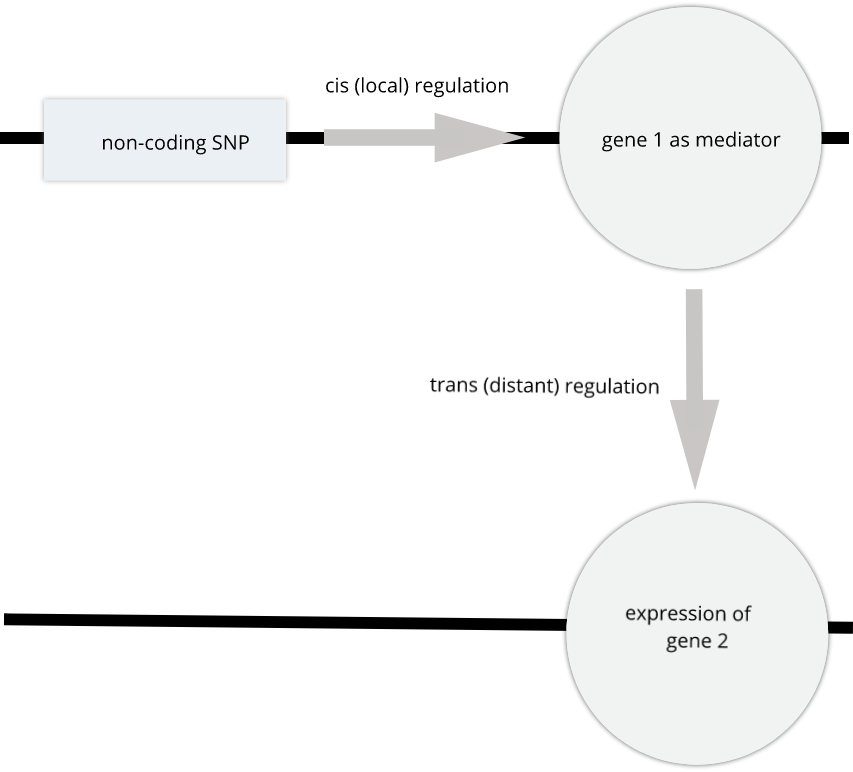
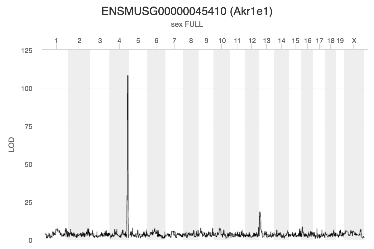
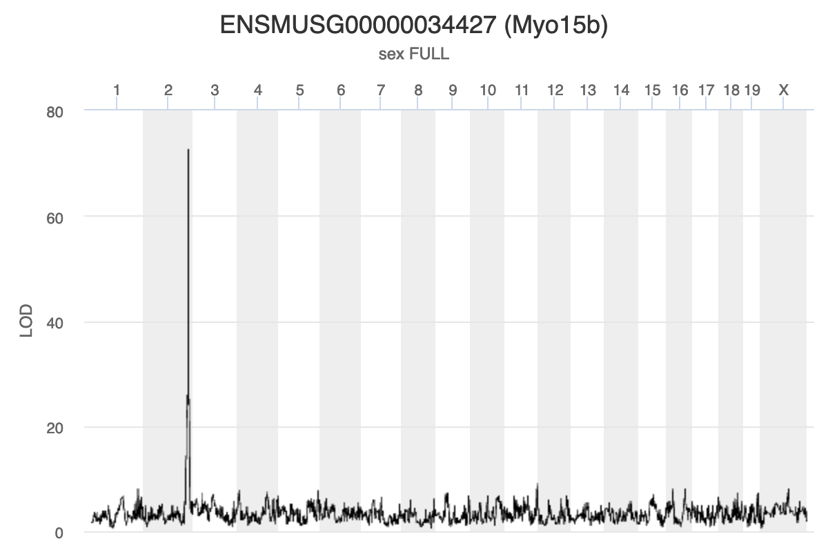
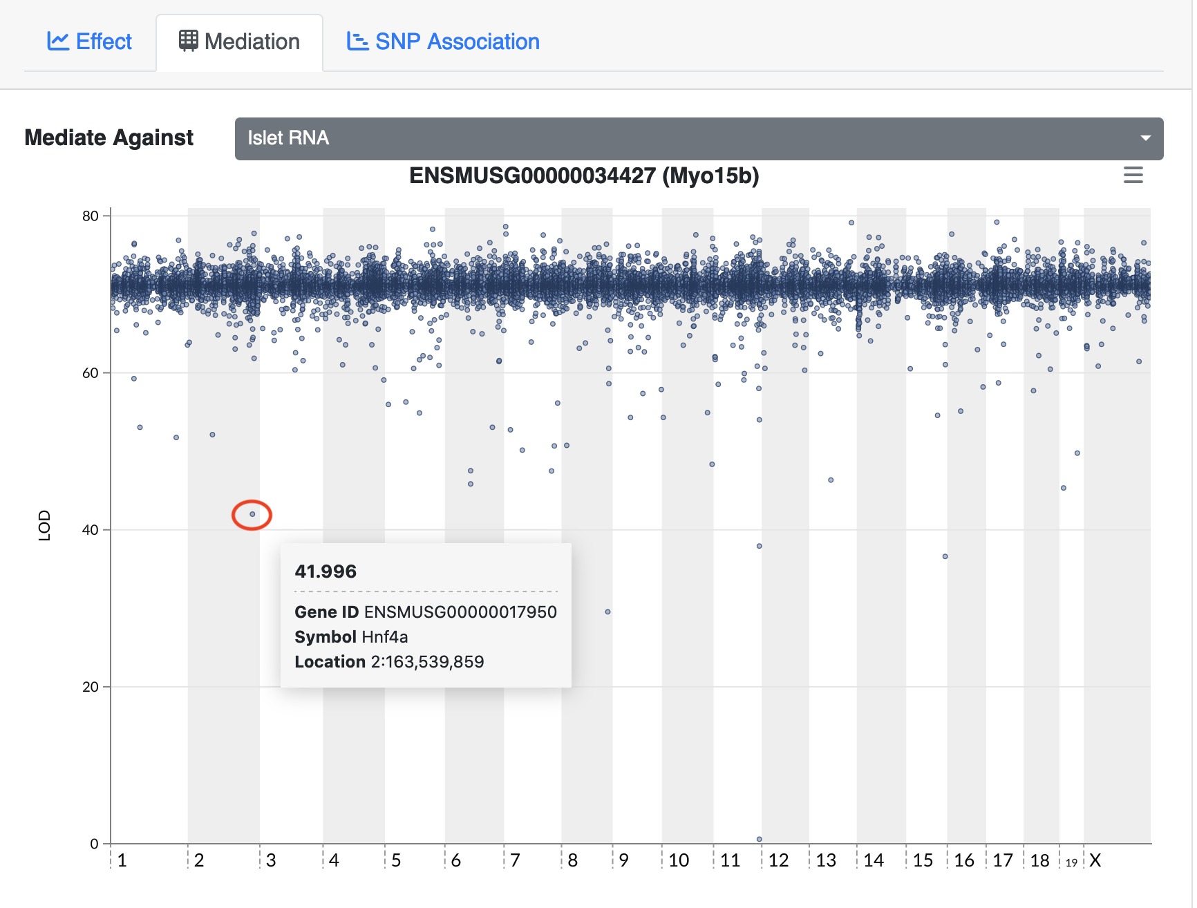
Challenge:
Solution
Key Points
Mediation analysis investigates an intermediary between an independent variable and its effect on a dependent variable.
Mediation analysis is used in high-throughput genomics studies to identify molecular phenotypes, such as gene expression or methylation traits, that mediate the effect of genetic variation on disease phenotypes or other outcomes of interest.